Containers
A box to put items into. |
|
A tabbed view. |
|
An arrangement of flexible width panes separated by vertical dividers. |
|
An arrangement of flexible width panes separated by horizontal dividers. |
|
Not yet implemented. |
|
A vertical stack of items. |
|
A scrollable vertical stack. |
|
A horizontal stack of items. |
|
A closable pane with a title and content. |
|
A grid of items. |
|
A scrollable grid. |
|
A grid of image buttons. |
Group
- class ezui.Group
- enable(onOff)
Enable or disable the object. onOff should be a boolean.
- getItem(identifier)
Get the item with
identifiercontained within this container.
- getItemValue(identifier)
Get the value for the item with
identifier.
- getItemValues()
Get the values for all items with identifiers contained within this container. This will be a dictionary with identifiers as keys and the item values as the values.
- getItems(**kwargs)
Get all items with identifiers contained within this container. This will be a dictionary with identifiers as keys and the item values as the values.
Subclasses may override this for special recursion behavior.
- setItemValue(identifier, value)
Set the value for the item with
identifier.
- setItemValues(values)
Set the values for items.
valuesshould be a dictionary with identifiers as keys and the item values as the values.
- setItemsEnabled(state)
Set the enabled state for all items within the container.
- show(onOff)
Show or hide the object.
onOff A boolean value representing if the object should be shown or not.
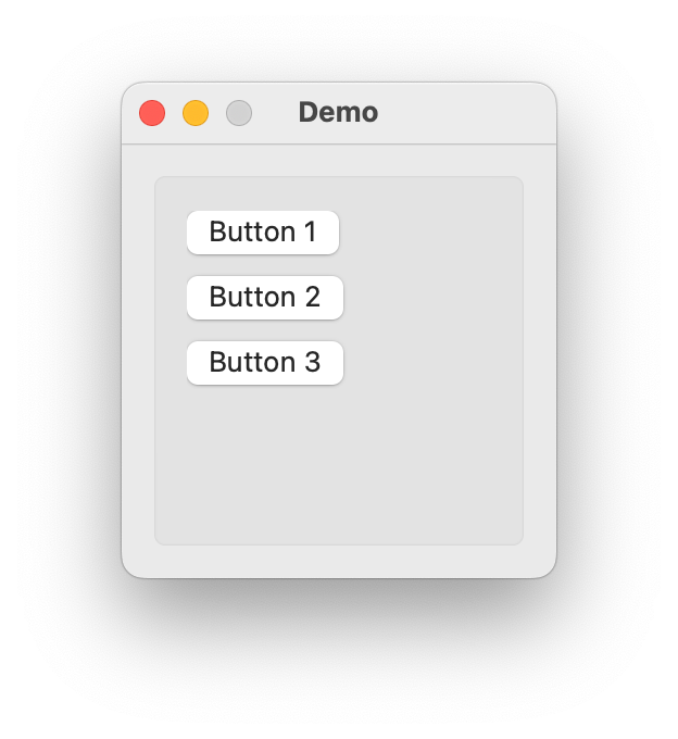
Box
- class ezui.Box
A box to put items into. Box usage reference.
To create a Box with a text description, use the item type name token
* Box.import ezui class DemoController(ezui.WindowController): def build(self): content = """ * Box > (Button 1) > (Button 2) > (Button 3) """ self.w = ezui.EZWindow( title="Demo", size=(200, 200), content=content, controller=self ) def started(self): self.w.open() DemoController()
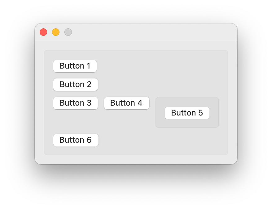
import ezui

class DemoController(ezui.WindowController):

    def build(self):
        content = """
        * Box
        # all containers have a vertical stack
        # as their default content type
        > (Button 1)
        > (Button 2)
        > * HorizontalStack
        >> (Button 3)
        >> (Button 4)
        >> * Box
        >>> (Button 5)
        > (Button 6)
        """
        descriptionData = dict()
        self.w = ezui.EZWindow(
            content=content,
            descriptionData=descriptionData,
            controller=self
        )

    def started(self):
        self.w.open()

DemoController()
Description Data
contentA description of the content to display in the box.titleA title to display on the box. Optional.marginsThe margins to inset the items from the frame of the box. This can be an integer or tuple of (x, y) integers. Optional.drawBackgroundIf the background is drawn. Optional.backgroundColorThe background color. ANSColoror(r, g, b, a)tuple. Optional.borderColorThe border color. ANSColoror(r, g, b, a)tuple. Optional.borderWidthThe border width. Optional.cornerRadiusThe corner radius of the box. Optional.toolTipThe text for the view’s tooltip.Warning
backgroundColor,borderColor,borderWidthandcornerRadiusshould not be used for anything other than debugging unless you have a really good reason to use them.- getItem(identifier)
Get the item with
identifiercontained within this container.
- getItemValue(identifier)
Get the value for the item with
identifier.
- getItemValues()
Get the values for all items with identifiers contained within this container. This will be a dictionary with identifiers as keys and the item values as the values.
- getItems(**kwargs)
Get all items with identifiers contained within this container. This will be a dictionary with identifiers as keys and the item values as the values.
Subclasses may override this for special recursion behavior.
- setItemValue(identifier, value)
Set the value for the item with
identifier.
- setItemValues(values)
Set the values for items.
valuesshould be a dictionary with identifiers as keys and the item values as the values.
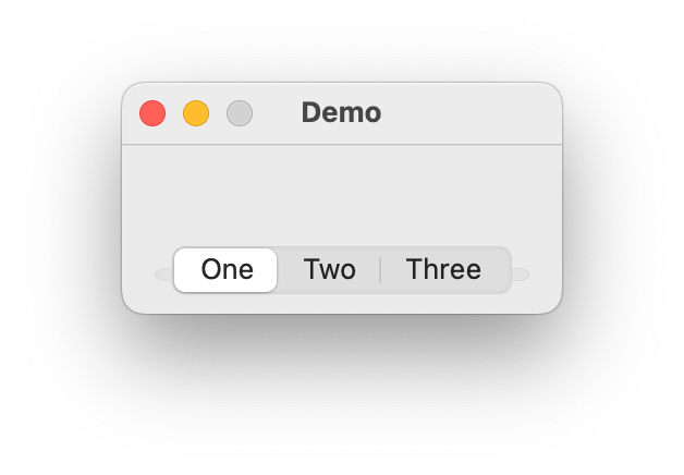
Tabs
- class ezui.Tabs
A tabbed view. Tabs usage reference.
To create Tabs with a text description, use the item type name token
* Tabs.To define a tab, use
* Tab:followed by the text you want to be displayed in the tab button.To define the content of a tab, add a
>nest indicator for each item you want to display in the tab. The default container type for a tab isVerticalStack. To change the container type, follow the name of the tab with= ContainerTypewithContainerTypebeing the name of the container type you want to use.import ezui class DemoController(ezui.WindowController): def build(self): content = """ = Tabs * Tab: One @tab1 > This is tab one. * Tab: Two @tab2 > This > is > tab > two. * Tab: Three = HorizontalStack @tab3 > This > is > tab > three. """ self.w = ezui.EZWindow( title="Demo", content=content, controller=self ) def started(self): self.w.open() DemoController()
Description Data
contentsA list of tab definition dictionaries. These have the following form:key
value
"identifier"The unique identifier for the tab.
"text"The title for the tab.
Optional.
"content"A description of the content of the tab.
Optional.
marginsThe margins between the edge of the tab and the tab contents. This can be an integer indicating the margin on all sides, a tuple of two integers indicating the (x, y) margins or a tuple of four integers indicating the (left, bottom, right, top) margins. Optional.showButtonsIf the tab buttons should be visible. Optional.callbackThe function to call when a tab is selected.toolTipThe text for the view’s tooltip.- getItems(**kwargs)
Get all items with identifiers contained within this container. This will be a dictionary with identifiers as keys and the item values as the values.
Subclasses may override this for special recursion behavior.
- getTab(identifier)
Get a specific tab.
- setSelectedTab(identifier)
Set the selected tab.
- getSelectedTab()
Get the selected tab.
- getItem(identifier)
Get the item with
identifiercontained within this container.
- getItemValue(identifier)
Get the value for the item with
identifier.
- getItemValues()
Get the values for all items with identifiers contained within this container. This will be a dictionary with identifiers as keys and the item values as the values.
- setItemValue(identifier, value)
Set the value for the item with
identifier.
- setItemValues(values)
Set the values for items.
valuesshould be a dictionary with identifiers as keys and the item values as the values.
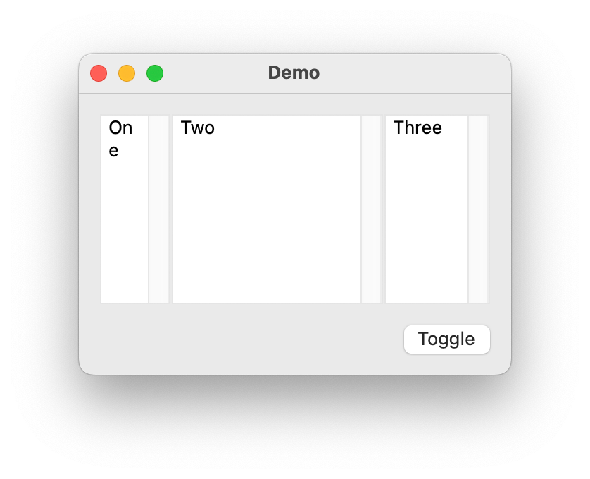
VerticalSplits
- class ezui.VerticalSplits
An arrangement of flexible width panes separated by vertical dividers.
To create a VerticalSplits with a text description, use the item type name token
* VerticalSplits. To define the contents, add a>nest indicator for each item you want to display in the splits.To define a pane, use
* SplitsPane.To define the content of a pane, add a
>nest indicator for each item you want to display in the pane. The default container type for a pane isVerticalStack. To change the container type, followVerticalSplitswith= ContainerTypewithContainerTypebeing the name of the container type you want to use.import ezui class DemoController(ezui.WindowController): def build(self): content = """ = VerticalSplits * SplitsPane @pane1 > [[_One_]] @editor1 * SplitsPane @pane2 > [[_Two_]] @editor2 * SplitsPane @pane3 > [[_Three_]] @editor3 ============= (Toggle) @toggleButton """ descriptionData = dict( pane1=dict( preferredThickness=100, minThickness=50, maxThickness=200, priority=101 ), pane2=dict( preferredThickness=200, minThickness=150, priority=100 ), pane3=dict( preferredThickness=100, minThickness=75, canCollapse=True, priority=102 ), editor1=dict( height="fill" ), editor2=dict( height="fill" ), editor3=dict( height="fill" ) ) self.w = ezui.EZWindow( title="Demo", content=content, descriptionData=descriptionData, controller=self, size=("auto", 200), minSize=(100, 100), ) def started(self): self.w.open() def toggleButtonCallback(self, sender): pane = self.w.getItem("pane3") pane.toggle() DemoController()
Description Data
contentsA list of item descriptions. These have the following form:key
value
"identifier"The unique identifier for the pane.
Optional.
"minThickness"An integer representing the minimum thickness of the pane.
Optional.
"maxThickness"An integer representing the maximum thickness of the pane.
Optional.
"preferredThickness"An integer representing the preferred thickness of the pane.
Optional.
"canCollapse"If the pane can collapse. The default is
False.Optional.
"collapsed"A boolean representing if the pane is initially collapsed. The default is
False.Optional.
"priority"An integer between 0 and 1000 indicating the resize priority for this pane. The pane with the lowest value will be resized before other panes.
Optional.
dividerColorANSColoror(r, g, b, a)tuple that the divider should be drawn with. Optional.dividerThicknessThe thickness of the divider. See Apple’s recommendations on when changing from the default thickness is recommended. (It’s not recommended often if at all.) Optional.autosaveNameAn identifier for this split view. This will be used to store the pane sized in the application preferences. Optional.resizeCallbackThe function to call when the panes are resized. Optional.toolTipThe text for the view’s tooltip.- getItem(identifier)
Get the item with
identifiercontained within this container.
- getItemValue(identifier)
Get the value for the item with
identifier.
- getItemValues()
Get the values for all items with identifiers contained within this container. This will be a dictionary with identifiers as keys and the item values as the values.
- getItems(**kwargs)
Get all items with identifiers contained within this container. This will be a dictionary with identifiers as keys and the item values as the values.
Subclasses may override this for special recursion behavior.
- setItemValue(identifier, value)
Set the value for the item with
identifier.
- setItemValues(values)
Set the values for items.
valuesshould be a dictionary with identifiers as keys and the item values as the values.
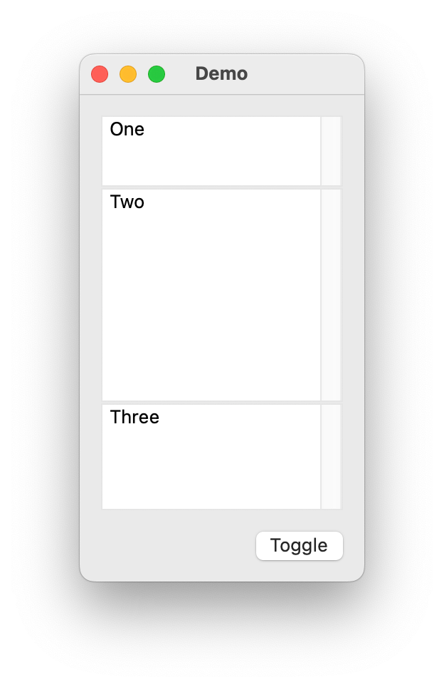
HorizontalSplits
- class ezui.HorizontalSplits
An arrangement of flexible width panes separated by horizontal dividers.
To create a HorizontalSplits with a text description, use the item type name token
* HorizontalSplits. To define the contents, add a>nest indicator for each item you want to display in the splits.To define a pane, use
* SplitsPane.To define the content of a pane, add a
>nest indicator for each item you want to display in the pane. The default container type for a pane isVerticalStack. To change the container type, followHorizontalSplitswith= ContainerTypewithContainerTypebeing the name of the container type you want to use.import ezui class DemoController(ezui.WindowController): def build(self): content = """ = HorizontalSplits * SplitsPane @pane1 > [[_One_]] @editor1 * SplitsPane @pane2 > [[_Two_]] @editor2 * SplitsPane @pane3 > [[_Three_]] @editor3 ============= (Toggle) @toggleButton """ descriptionData = dict( pane1=dict( preferredThickness=100, minThickness=50, maxThickness=200, priority=101 ), pane2=dict( preferredThickness=200, minThickness=150, priority=100 ), pane3=dict( preferredThickness=100, minThickness=75, canCollapse=True, priority=102 ), editor1=dict( width="fill", height="fill" ), editor2=dict( width="fill", height="fill" ), editor3=dict( width="fill", height="fill" ) ) self.w = ezui.EZWindow( title="Demo", content=content, descriptionData=descriptionData, controller=self, size=(200, "auto"), minSize=(100, 100), ) def started(self): self.w.open() def toggleButtonCallback(self, sender): pane = self.w.getItem("pane3") pane.toggle() DemoController()
Description Data
contentsA list of item descriptions. These have the following form:key
value
"identifier"The unique identifier for the pane.
Optional.
"minThickness"An integer representing the minimum thickness of the pane.
Optional.
"maxThickness"An integer representing the maximum thickness of the pane.
Optional.
"preferredThickness"An integer representing the preferred thickness of the pane.
Optional.
"canCollapse"If the pane can collapse. The default is
False.Optional.
"collapsed"A boolean representing if the pane is initially collapsed. The default is
False.Optional.
"priority"An integer between 0 and 1000 indicating the resize priority for this pane. The pane with the lowest value will be resized before other panes.
Optional.
dividerColorANSColoror(r, g, b, a)tuple that the divider should be drawn with. Optional.dividerThicknessThe thickness of the divider. See Apple’s recommendations on when changing from the default thickness is recommended. (It’s not recommended often if at all.) Optional.autosaveNameAn identifier for this split view. This will be used to store the pane sized in the application preferences. Optional.resizeCallbackThe function to call when the panes are resized. Optional.toolTipThe text for the view’s tooltip.- getItem(identifier)
Get the item with
identifiercontained within this container.
- getItemValue(identifier)
Get the value for the item with
identifier.
- getItemValues()
Get the values for all items with identifiers contained within this container. This will be a dictionary with identifiers as keys and the item values as the values.
- getItems(**kwargs)
Get all items with identifiers contained within this container. This will be a dictionary with identifiers as keys and the item values as the values.
Subclasses may override this for special recursion behavior.
- setItemValue(identifier, value)
Set the value for the item with
identifier.
- setItemValues(values)
Set the values for items.
valuesshould be a dictionary with identifiers as keys and the item values as the values.
ScrollView
- class ezui.ScrollView
Not yet implemented. ScrollView usage reference.
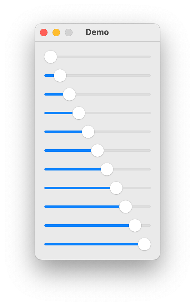
VerticalStack
- class ezui.VerticalStack
A vertical stack of items.
To create a VerticalStack with a text description, use the item type name token
* VerticalStack. To define the contents, add a>nest indicator for each item you want to display in the stack.import ezui class DemoController(ezui.WindowController): def build(self): content = """ = VerticalStack X---------- @slider0 -X--------- @slider1 --X-------- @slider2 ---X------- @slider3 ----X------ @slider4 -----X----- @slider5 ------X---- @slider6 -------X--- @slider7 --------X-- @slider8 ---------X- @slider9 ----------X @slider10 """ descriptionData = dict( slider0=dict(value=0), slider1=dict(value=10), slider2=dict(value=20), slider3=dict(value=30), slider4=dict(value=40), slider5=dict(value=50), slider6=dict(value=60), slider7=dict(value=70), slider8=dict(value=80), slider9=dict(value=90), slider10=dict(value=100) ) self.w = ezui.EZWindow( title="Demo", size=(200, "auto"), content=content, descriptionData=descriptionData, controller=self ) def started(self): self.w.open() DemoController()
Description Data
contentsA list of item descriptions. These have the following form:key
value
"identifier"The unique identifier for the item.
Optional.
"item"An instantiated vanilla object. If given, the rest of the item definition will be ignored.
Optional.
"width"The width of the item. This can be an integer,
"auto"(the default),"fit"indicating that the item should be fit to its content or"fill"indicating that the width of the item should be the width of the stack. See example below.Optional.
"height"The height of the item. Heights should only be set when an item doesn’t have a standard height.
Optional.
"bottomPadding"A value to add to
spacingafter the item.Optional.
import ezui

class DemoController(ezui.WindowController):

    def build(self):
        content = """
        = VerticalStack
        (default)  @defaultItem
        (fit)      @fitItem
        (fill)     @fillItem
        (100)      @intItem
        """
        descriptionData = dict(
            defaultItem=dict(
                # defaults
            ),
            fitItem=dict(
                width="fit"
            ),
            fillItem=dict(
                width="fill"
            ),
            intItem=dict(
                width=100
            )
        )
        self.w = ezui.EZWindow(
            title="Demo",
            size=(200, "auto"),
            content=content,
            descriptionData=descriptionData,
            controller=self
        )

    def started(self):
        self.w.open()

DemoController()
spacingThe spacing to put between items.marginsThe margins between the edge of the stack and the stack contents. This can be an integer indicating the margin on all sides, a tuple of two integers indicating the (x, y) margins or a tuple of four integers indicating the (left, bottom, right, top) margins. Optional.distributionThe vertical distribution of the items within the stack. Options:"auto""equalCentering""equalSpacing""fill""fillEqually""fillProportionally""gravity"
import ezui

class DemoController(ezui.WindowController):

    def build(self):
        content = """
        = Tabs
        * Tab: auto @autoTab = VerticalStack @autoStack
        > [[_ 25  _]] @auto1
        > [[_ 50  _]] @auto2
        > [[_ 100 _]] @auto3
        * Tab: equalCentering = VerticalStack @equalCenteringStack
        > [[_ 25  _]] @equalCentering1
        > [[_ 50  _]] @equalCentering2
        > [[_ 100 _]] @equalCentering3
        * Tab: equalSpacing = VerticalStack @equalSpacingStack
        > [[_ 25  _]] @equalSpacing1
        > [[_ 50  _]] @equalSpacing2
        > [[_ 100 _]] @equalSpacing3
        * Tab: fill = VerticalStack @fillStack
        > [[_ 25  _]] @fill1
        > [[_ 50  _]] @fill2
        > [[_ 100 _]] @fill3
        * Tab: fillEqually = VerticalStack @fillEquallyStack
        > [[_ 25  _]] @fillEqually1
        > [[_ 50  _]] @fillEqually2
        > [[_ 100 _]] @fillEqually3
        * Tab: fillProportionally = VerticalStack @fillProportionallyStack
        > [[_ 25  _]] @fillProportionally1
        > [[_ 50  _]] @fillProportionally2
        > [[_ 100 _]] @fillProportionally3
        * Tab: gravity = VerticalStack @gravityStack
        > [[_ 25  _]] @gravity1
        > [[_ 50  _]] @gravity2
        > [[_ 100 _]] @gravity3
        """
        descriptionData = dict(
            autoStack=dict(
                distribution="auto"
            ),
            auto1=dict(height=25),
            auto2=dict(height=50),
            auto3=dict(height=100),

            equalCenteringStack=dict(
                distribution="equalCentering"
            ),
            equalCentering1=dict(height=25),
            equalCentering2=dict(height=50),
            equalCentering3=dict(height=100),

            equalSpacingStack=dict(
                distribution="equalSpacing"
            ),
            equalSpacing1=dict(height=25),
            equalSpacing2=dict(height=50),
            equalSpacing3=dict(height=100),

            fillStack=dict(
                distribution="fill"
            ),
            fill1=dict(height=25),
            fill2=dict(height=50),
            fill3=dict(height=100),

            fillEquallyStack=dict(
                distribution="fillEqually"
            ),
            fillEqually1=dict(height=25),
            fillEqually2=dict(height=50),
            fillEqually3=dict(height=100),

            fillProportionallyStack=dict(
                distribution="fillProportionally"
            ),
            fillProportionally1=dict(height=25),
            fillProportionally2=dict(height=50),
            fillProportionally3=dict(height=100),

            gravityStack=dict(
                distribution="gravity"
            ),
            gravity1=dict(height=25),
            gravity2=dict(height=50),
            gravity3=dict(height=100),
        )
        self.w = ezui.EZWindow(
            title="Demo",
            size=(650, 500),
            content=content,
            descriptionData=descriptionData,
            controller=self
        )

    def started(self):
        self.w.open()

DemoController()
alignmentWhere to align the items. Options:"leading""center""trailing"
toolTipThe text for the view’s tooltip.- getItem(identifier)
Get the item with
identifiercontained within this container.
- getItemValue(identifier)
Get the value for the item with
identifier.
- getItemValues()
Get the values for all items with identifiers contained within this container. This will be a dictionary with identifiers as keys and the item values as the values.
- getItems(**kwargs)
Get all items with identifiers contained within this container. This will be a dictionary with identifiers as keys and the item values as the values.
Subclasses may override this for special recursion behavior.
- setItemValue(identifier, value)
Set the value for the item with
identifier.
- setItemValues(values)
Set the values for items.
valuesshould be a dictionary with identifiers as keys and the item values as the values.
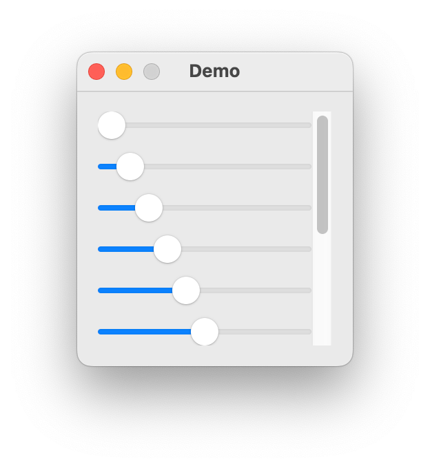
ScrollingVerticalStack
- class ezui.ScrollingVerticalStack
A scrollable vertical stack. Refer to
VerticalStackfor options.To create a ScrollingVerticalStack with a text description, use the item type name token
* ScrollingVerticalStack. To define the contents, add a>nest indicator for each item you want to display in the stack.import ezui class DemoController(ezui.WindowController): def build(self): content = """ = ScrollingVerticalStack X---------- @slider0 -X--------- @slider1 --X-------- @slider2 ---X------- @slider3 ----X------ @slider4 -----X----- @slider5 ------X---- @slider6 -------X--- @slider7 --------X-- @slider8 ---------X- @slider9 ----------X @slider10 """ descriptionData = dict( slider0=dict(value=0), slider1=dict(value=10), slider2=dict(value=20), slider3=dict(value=30), slider4=dict(value=40), slider5=dict(value=50), slider6=dict(value=60), slider7=dict(value=70), slider8=dict(value=80), slider9=dict(value=90), slider10=dict(value=100) ) self.w = ezui.EZWindow( title="Demo", size=(200, 200), content=content, descriptionData=descriptionData, controller=self ) def started(self): self.w.open() DemoController()
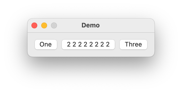
HorizontalStack
- class ezui.HorizontalStack
A horizontal stack of items.
To create a HorizontalStack with a text description, use the item type name token
* HorizontalStack. To define the contents, add a>nest indicator for each item you want to display in the stack.import ezui class DemoController(ezui.WindowController): def build(self): content = """ = HorizontalStack (One) (2 2 2 2 2 2 2 2) (Three) """ self.w = ezui.EZWindow( title="Demo", content=content, controller=self ) def started(self): self.w.open() DemoController()
Description Data
contentsA list of item descriptions. These have the following form:key
value
"identifier"The unique identifier for the item.
Optional.
"item"An instantiated vanilla object. If given, the rest of the item definition will be ignored.
Optional.
"width"The width of the item. Widths should only be set when an item doesn’t have a standard width.
Optional.
"height"The height of the item. This can be an integer,
"auto"(the default),"fit"indicating that the item should be fit to its content or"fill"indicating that the height of the item should be the height of the stack. See example below.Optional.
"bottomPadding"A value to add to
spacingafter the item.Optional.
import ezui

class DemoController(ezui.WindowController):

    def build(self):
        content = """
        = HorizontalStack
        * Box @defaultItem
        > default
        * Box @fitItem
        > fit
        * Box @fillItem
        > fill
        * Box @intItem
        > 100
        """
        descriptionData = dict(
            defaultItem=dict(
                # defaults
                width=100,
            ),
            fitItem=dict(
                width=100,
                height="fit"
            ),
            fillItem=dict(
                width=100,
                height="fill"
            ),
            intItem=dict(
                width=100,
                height=100
            )
        )
        self.w = ezui.EZWindow(
            title="Demo",
            size=("auto", 300),
            content=content,
            descriptionData=descriptionData,
            controller=self
        )

    def started(self):
        self.w.open()

DemoController()
spacingThe spacing to put between items.marginsThe margins between the edge of the stack and the stack contents. This can be an integer indicating the margin on all sides, a tuple of two integers indicating the (x, y) margins or a tuple of four integers indicating the (left, bottom, right, top) margins. Optional.distributionThe horizontal distribution of the items within the stack. Options:"auto""equalCentering""equalSpacing""fill""fillEqually""fillProportionally""gravity"
import ezui

class DemoController(ezui.WindowController):

    def build(self):
        content = """
        = Tabs
        * Tab: auto @autoTab = HorizontalStack @autoStack
        > [[_ 25  _]] @auto1
        > [[_ 50  _]] @auto2
        > [[_ 100 _]] @auto3
        * Tab: equalCentering = HorizontalStack @equalCenteringStack
        > [[_ 25  _]] @equalCentering1
        > [[_ 50  _]] @equalCentering2
        > [[_ 100 _]] @equalCentering3
        * Tab: equalSpacing = HorizontalStack @equalSpacingStack
        > [[_ 25  _]] @equalSpacing1
        > [[_ 50  _]] @equalSpacing2
        > [[_ 100 _]] @equalSpacing3
        * Tab: fill = HorizontalStack @fillStack
        > [[_ 25  _]] @fill1
        > [[_ 50  _]] @fill2
        > [[_ 100 _]] @fill3
        * Tab: fillEqually = HorizontalStack @fillEquallyStack
        > [[_ 25  _]] @fillEqually1
        > [[_ 50  _]] @fillEqually2
        > [[_ 100 _]] @fillEqually3
        * Tab: fillProportionally = HorizontalStack @fillProportionallyStack
        > [[_ 25  _]] @fillProportionally1
        > [[_ 50  _]] @fillProportionally2
        > [[_ 100 _]] @fillProportionally3
        * Tab: gravity = HorizontalStack @gravityStack
        > [[_ 25  _]] @gravity1
        > [[_ 50  _]] @gravity2
        > [[_ 100 _]] @gravity3
        """
        descriptionData = dict(
            autoStack=dict(
                distribution="auto"
            ),
            auto1=dict(width=25),
            auto2=dict(width=50),
            auto3=dict(width=100),

            equalCenteringStack=dict(
                distribution="equalCentering"
            ),
            equalCentering1=dict(width=25),
            equalCentering2=dict(width=50),
            equalCentering3=dict(width=100),

            equalSpacingStack=dict(
                distribution="equalSpacing"
            ),
            equalSpacing1=dict(width=25),
            equalSpacing2=dict(width=50),
            equalSpacing3=dict(width=100),

            fillStack=dict(
                distribution="fill"
            ),
            fill1=dict(width=25),
            fill2=dict(width=50),
            fill3=dict(width=100),

            fillEquallyStack=dict(
                distribution="fillEqually"
            ),
            fillEqually1=dict(width=25),
            fillEqually2=dict(width=50),
            fillEqually3=dict(width=100),

            fillProportionallyStack=dict(
                distribution="fillProportionally"
            ),
            fillProportionally1=dict(width=25),
            fillProportionally2=dict(width=50),
            fillProportionally3=dict(width=100),

            gravityStack=dict(
                distribution="gravity"
            ),
            gravity1=dict(width=25),
            gravity2=dict(width=50),
            gravity3=dict(width=100),
        )
        self.w = ezui.EZWindow(
            title="Demo",
            size=(650, 200),
            content=content,
            descriptionData=descriptionData,
            controller=self
        )

    def started(self):
        self.w.open()

DemoController()
alignmentWhere to align the items. Options:"leading""center""trailing"
- getItem(identifier)
Get the item with
identifiercontained within this container.
- getItemValue(identifier)
Get the value for the item with
identifier.
- getItemValues()
Get the values for all items with identifiers contained within this container. This will be a dictionary with identifiers as keys and the item values as the values.
- getItems(**kwargs)
Get all items with identifiers contained within this container. This will be a dictionary with identifiers as keys and the item values as the values.
Subclasses may override this for special recursion behavior.
- setItemValue(identifier, value)
Set the value for the item with
identifier.
- setItemValues(values)
Set the values for items.
valuesshould be a dictionary with identifiers as keys and the item values as the values.
AccordionStack
- class ezui.AccordionStack
A vertical stack of accordions.
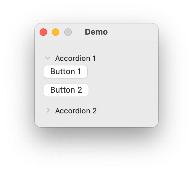
Accordion
- class ezui.Accordion
A closable pane with a title and content.
To create an Accordion with a text description, use
* Accordion:followed by the text you want to be displayed in the title bar.To define the content of an accordion, add a
>nest indicator for each item you want to display in the accordion. The default container type for an accordion isVerticalStack. To change the container type, follow the name of the accordion with= ContainerTypewithContainerTypebeing the name of the container type you want to use.import ezui class DemoController(ezui.WindowController): def build(self): content = """ * Accordion: Accordion 1 @accordion1 > (Button 1) > (Button 2) * Accordion: Accordion 2 @accordion2 > (Button 3) > (Button 4) """ descriptionData = dict( accordion2=dict( closed=True ) ) self.w = ezui.EZWindow( title="Demo", size=(200, "auto"), content=content, descriptionData=descriptionData, controller=self ) def started(self): self.w.open() DemoController()
Description Data
textThe title of the accordion.contentThe item description for the content.contentHeightThe height of the content. (optional)closableIf the accordion is closable.closedIf the accordion is closed.toolTipThe text for the view’s tooltip.- getItem(identifier)
Get the item with
identifiercontained within this container.
- getItemValue(identifier)
Get the value for the item with
identifier.
- getItemValues()
Get the values for all items with identifiers contained within this container. This will be a dictionary with identifiers as keys and the item values as the values.
- getItems(**kwargs)
Get all items with identifiers contained within this container. This will be a dictionary with identifiers as keys and the item values as the values.
Subclasses may override this for special recursion behavior.
- setItemValue(identifier, value)
Set the value for the item with
identifier.
- setItemValues(values)
Set the values for items.
valuesshould be a dictionary with identifiers as keys and the item values as the values.
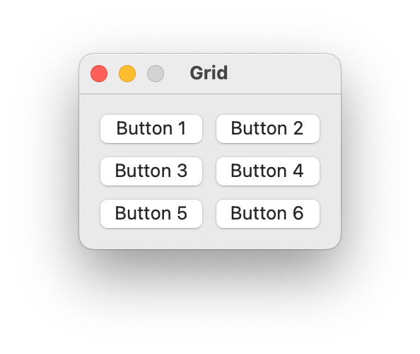
Grid
- class ezui.Grid
A grid of items.
Warning
Grid is a work in progress. Do not use it in production code.
contentsA list of row descriptions.key
value
default
"type"The item type. This must be
"GridRow"Required.
"contents"A list of item descriptions.
Required.
"rowHeight"rowHeightOptional.
"rowPadding"rowPaddingOptional.
"rowPlacement"rowPlacementOptional.
"rowAlignment"rowAlignmentOptional.
The
itemDescriptionslist should contain item definition dictionaries that can be created withmakeItem(). Additionally, the dictionaries may have the following key/value pairs:key
value
default
"width"NoneOptional.
"height"NoneOptional.
"rowPlacement"NoneOptional.
"rowAlignment"NoneOptional.
"columnPlacement"NoneOptional.
rowHeightThe height for rows.rowSpacingThe amount of spacing between rows.rowPaddingThe (top, bottom) padding for rows.rowPlacementThe vertical placement of content within rows. Options:"top""center""bottom""fill"
rowAlignmentThe alignment of the row. Options:"firstBaseline""lastBaseline""none"
columnDescriptionsAn optional list of dictionaries defining column specific settings. Options:key
value
default
"width"widthOptional.
"columnPadding"columnPaddingOptional.
"columnPlacement"columnPlacementOptional.
columnWidthThe width for columns.columnSpacingThe amount of spacing between columns.columnPaddingThe (left, right) padding for columns.columnPlacementThe horizontal placement of content within columns. Options:"leading""center""trailing""fill"
toolTipThe text for the view’s tooltip.import ezui class DemoController(ezui.WindowController): def build(self): button1 = dict( identifier="button1", type="PushButton", text="Button 1" ) button2 = dict( identifier="button2", type="PushButton", text="Button 2" ) button3 = dict( identifier="button3", type="PushButton", text="Button 3" ) button4 = dict( identifier="button4", type="PushButton", text="Button 4" ) button5 = dict( identifier="button5", type="PushButton", text="Button 5" ) button6 = dict( identifier="button6", type="PushButton", text="Button 6" ) rowDescriptions = [ dict( itemDescriptions=[ button1, button2 ] ), dict( itemDescriptions=[ button3, button4 ] ), dict( itemDescriptions=[ button5, button6 ] ) ] windowContent = dict( type="Grid", rowDescriptions=rowDescriptions, columnPlacement="fill" ) windowDescription = dict( type="Window", size="auto", title="Grid", content=windowContent ) self.w = ezui.makeItem( windowDescription, controller=self ) def started(self): self.w.open() DemoController()
- getItem(identifier)
Get the item with
identifiercontained within this container.
- getItemValue(identifier)
Get the value for the item with
identifier.
- getItemValues()
Get the values for all items with identifiers contained within this container. This will be a dictionary with identifiers as keys and the item values as the values.
- getItems(**kwargs)
Get all items with identifiers contained within this container. This will be a dictionary with identifiers as keys and the item values as the values.
Subclasses may override this for special recursion behavior.
- setItemValue(identifier, value)
Set the value for the item with
identifier.
- setItemValues(values)
Set the values for items.
valuesshould be a dictionary with identifiers as keys and the item values as the values.
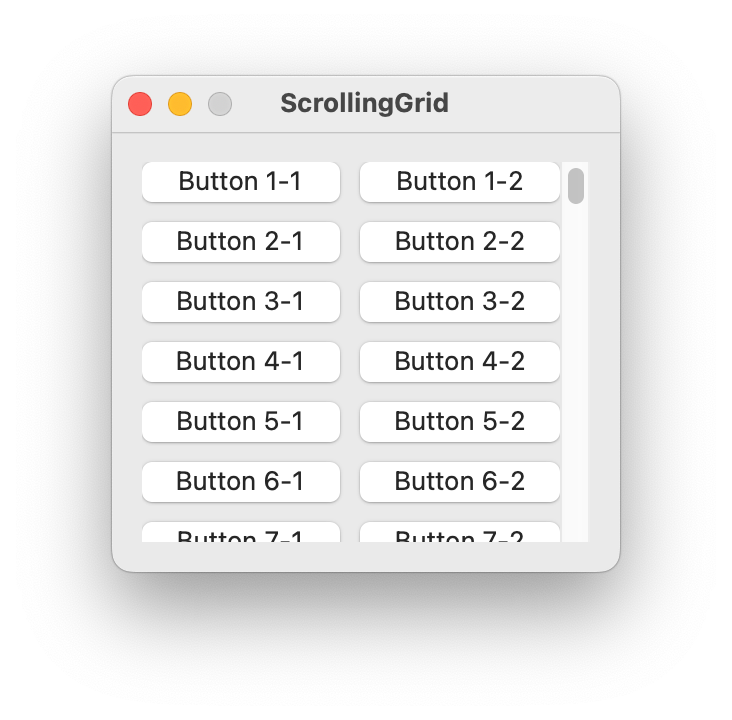
ScrollingGrid
- class ezui.ScrollingGrid
A scrollable grid. Refer to
Gridfor options.import ezui class DemoController(ezui.WindowController): def build(self): rowDescriptions = [] for rowIndex in range(1, 101): rowDescription = dict( itemDescriptions=[ dict( identifier=f"button_{rowIndex}_1", type="PushButton", text=f"Button {rowIndex}-1" ), dict( identifier=f"button_{rowIndex}_2", type="PushButton", text=f"Button {rowIndex}-2" ) ] ) rowDescriptions.append(rowDescription) windowContent = dict( type="ScrollingGrid", rowDescriptions=rowDescriptions, columnPlacement="fill" ) windowDescription = dict( type="Window", size=("auto", 220), title="ScrollingGrid", content=windowContent ) self.w = ezui.makeItem( windowDescription, controller=self ) def started(self): self.w.open() DemoController()