Items
Static
A line of text. |
|
|
A horizontal line. |
|
A vertical line. |
An image. |
Buttons
A push button. |
|
A push button with an image. |
|
A help button. |
|
A settings button. |
|
A button with add and remove segments. |
|
A stepper button. |
Selectors
A pop up button. |
|
A button with sub segments. |
|
A group of radio buttons. |
|
A checkbox, optionally with text next to it. |
|
A group of checkboxes. |
|
A switch. |
|
A slider. |
|
A slider and a label. |
|
A slider and a text field. |
|
A slider, a text field and a stepper. |
|
A control that shows a color and, when pressed, displays the system color picker. |
Menu Buttons
A pull down button that displays a menu. |
|
An action button. |
Text Input
A field with editable text. |
|
A text field and a stepper. |
|
A combo box. |
|
A multi-line text editor. |
Progress Indicators
A progress bar. |
|
A progress spinner. |
Table
A table of data. |
|
A table of files. |
|
A table of fontParts fonts. |
|
A group row item. |
Views
A MerzView. |
|
A ScrollingMerzView. |
|
A web view. |
Label
- class ezui.Label
A line of text. Label usage reference.
To create a Label with a text description, use any text that doesn’t match any other text description pattern.
This is a label.
If you want to change the style of the label from the default, append 1-11
!followed by a space before your text.! This is a label. !! This is a label. !!! This is a label. !!!! This is a label. !!!!! This is a label. !!!!!! This is a label. !!!!!!! This is a label. !!!!!!!! This is a label. !!!!!!!!! This is a label. !!!!!!!!!! This is a label.
Common styles are accessible with the following.
!§ This is the section header style.
This is the body style.
!- This is the caption style.
!* This is the footnote style.
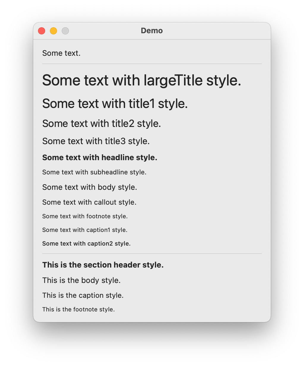
class DemoController(ezui.WindowController):

    def build(self):
        content = """
        Some text.
        -----
        ! Some text with largeTitle style.
        !! Some text with title1 style.
        !!! Some text with title2 style.
        !!!! Some text with title3 style.
        !!!!! Some text with headline style.
        !!!!!! Some text with subheadline style.
        !!!!!!! Some text with body style.
        !!!!!!!! Some text with callout style.
        !!!!!!!!! Some text with footnote style.
        !!!!!!!!!! Some text with caption1 style.
        !!!!!!!!!!! Some text with caption2 style.
        -----
        !§ This is the section header style.
        This is the body style.
        !- This is the caption style.
        !* This is the footnote style.
        """
        self.w = ezui.EZWindow(
            title="Demo",
            size=(400, "auto"),
            content=content,
            controller=self
        )

    def started(self):
        self.w.open()

DemoController()
Description Data
textThe text to display.valueTypeThe type of value allowed to be displayed."string""stringList""number""numberList""integer""integerList""float""floatList"
number, numberList, float and floatList default to rounding to three decimal places for display in the label. If you want more or less precision, add “:#” to the value type where “#” is an integer.
valueFallbackThe value to return when the text can’t be converted tovalueType.valueListDelimiterThe delimiter to use when breaking the value into lists.valueToStringConverterA value to string converter. Optional.stringToValueConverterA string to value converter. Optional.stringFormatterA string formatter. Optional.styleThe system defined text style.sizeStyleThe size of the item."mini""small""regular"
alignmentThe alignment of the text."left""right""center""justified""natural"(default)
toolTipThe text for the view’s tooltip.- get()
Get the text.
- set(value)
Set the text.
- enable(onOff)
Enable or disable the object. onOff should be a boolean.
- show(onOff)
Show or hide the object.
onOff A boolean value representing if the object should be shown or not.
Line
- class ezui.Line
A line. It will be horizontal or vertical depending on the type of container it is in.
To create a Line with a text description, use a line of text containing 1 or more hyphens.
----------
import ezui

class DemoController(ezui.WindowController):

    def build(self):
        content = """
        ---------------
        """
        self.w = ezui.EZWindow(
            title="Demo",
            size=(300, 100),
            content=content,
            controller=self
        )

    def started(self):
        self.w.open()

DemoController()
Description Data
There are no options. It’s just a line.
- show(onOff)
Show or hide the object.
onOff A boolean value representing if the object should be shown or not.
Image
- class ezui.Image
An image. Image usage reference.
import AppKit
import ezui

class DemoController(ezui.WindowController):

    def build(self):
        content = """
        * Image @image1
        * Image @image2
        """
        descriptionData = dict(
            image1=dict(
                image=ezui.makeImage(
                    imageName=AppKit.NSImageNameTrashFull
                )
            ),
            image2=dict(
                image=ezui.makeImage(
                    imageName=AppKit.NSImageNameTrashEmpty
                )
            )
        )
        self.w = ezui.EZWindow(
            title="Demo",
            size=(200, "auto"),
            content=content,
            descriptionData=descriptionData,
            controller=self
        )

    def started(self):
        self.w.open()

DemoController()
Description Data
imageANSImageobject to display. UsemakeImage()to create the object.symbolConfigurationA symbol configuration for the symbol. SeemakeSymbolConfiguration()for details. Optional.toolTipThe text for the view’s tooltip.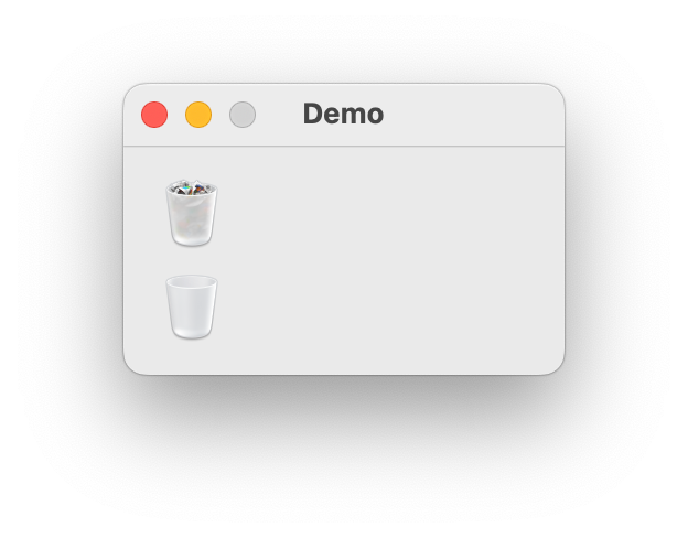
- show(onOff)
Show or hide the object.
onOff A boolean value representing if the object should be shown or not.
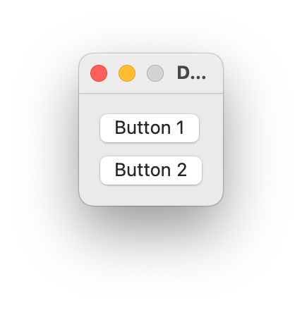
PushButton
- class ezui.PushButton
A push button. PushButton usage reference.
To create a PushButton with a text description, put
(and)around the text to be displayed in the button.(This Is A Push Button) @identifier
import ezui

class DemoController(ezui.WindowController):

    def build(self):
        content = """
        (Button 1) @button1
        (Button 2) @button2
        """
        self.w = ezui.EZWindow(
            title="Demo",
            content=content,
            controller=self
        )

    def started(self):
        self.w.open()

    def button1Callback(self, sender):
        print("Button 1 was pushed.")

    def button2Callback(self, sender):
        print("Button 2 was pushed.")

DemoController()
Description Data
textThe text in the button.callbackThe function to call when the button is pushed.keyEquivalentThe character (or one of the following) that should should trigger this button’s callback."help""home""end""pageup""pagedown""forwarddelete""leftarrow""rightarrow""uparrow""downarrow"
keyEquivalentModifiersThe modifier(s) to be applied tokeyEquivalentas a single string or a list of strings."command""control""option""shift""capslock"
sizeStyleThe size of the item."mini""small""regular"
toolTipThe text for the view’s tooltip.- enable(onOff)
Enable or disable the object. onOff should be a boolean.
- show(onOff)
Show or hide the object.
onOff A boolean value representing if the object should be shown or not.
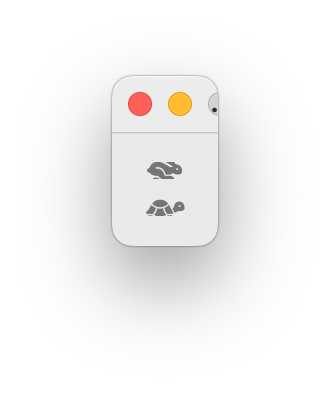
ImageButton
- class ezui.ImageButton
A push button with an image. ImageButton usage reference.
To create a PushButton with a text description, put
({and})around the SF Symbol name to be displayed in the button.({paintpalette.fill})import ezui class DemoController(ezui.WindowController): def build(self): content = """ ({hare.fill}) @button1 ({tortoise.fill}) @button2 """ self.w = ezui.EZWindow( title="Demo", content=content, controller=self ) def started(self): self.w.open() def button1Callback(self, sender): print("Button 1 was pushed.") def button2Callback(self, sender): print("Button 2 was pushed.") DemoController()
Description Data
imageANSImageobject to display in the segment. UsemakeImage()to create the object.drawBorderIf the button has a border.symbolConfigurationA symbol configuration for the symbol. SeemakeSymbolConfiguration()for details. Optional.keyEquivalentThe character (or one of the following) that should should trigger this button’s callback."help""home""end""pageup""pagedown""forwarddelete""leftarrow""rightarrow""uparrow""downarrow"
keyEquivalentModifiersThe modifier(s) to be applied tokeyEquivalentas a single string or a list of strings."command""control""option""shift""capslock"
callbackThe function to call when the button is pushed.sizeStyleThe size of the item."mini""small""regular"
toolTipThe text for the view’s tooltip.- enable(onOff)
Enable or disable the object. onOff should be a boolean.
- setImage(image)
Set the image in the button.
- show(onOff)
Show or hide the object.
onOff A boolean value representing if the object should be shown or not.
HelpButton
- class ezui.HelpButton
A help button. PushButton usage reference.
An HelpButton is created with the string
(?).(?) @identifierimport ezui class DemoController(ezui.WindowController): def build(self): content = """ (?) @helpButton """ self.w = ezui.EZWindow( title="Demo", content=content, controller=self ) def started(self): self.w.open() def helpButtonCallback(self, sender): print("Help button was pushed.") DemoController()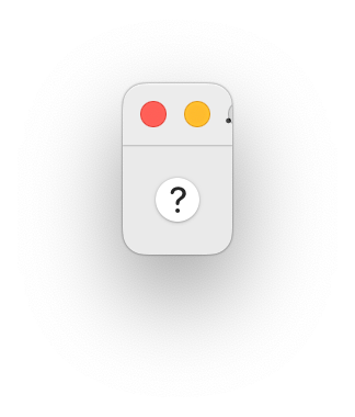
Description Data
callbackThe function to call when the button is pushed.
sizeStyleThe size of the item.
"mini"
"small"
"regular"
toolTipThe text for the view’s tooltip.
- enable(onOff)
Enable or disable the object. onOff should be a boolean.
- show(onOff)
Show or hide the object.
onOff A boolean value representing if the object should be shown or not.
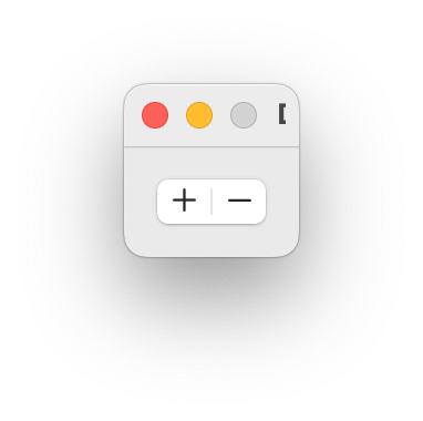
AddRemoveButton
- class ezui.AddRemoveButton
A button with add and remove segments.
An AddRemoveButton is created with the string
(+-)import ezui class DemoController(ezui.WindowController): def build(self): content = """ (+-) @addRemoveButton """ self.w = ezui.EZWindow( title="Demo", content=content, controller=self ) def started(self): self.w.open() def addRemoveButtonAddCallback(self, sender): print("add") def addRemoveButtonRemoveCallback(self, sender): print("remove") DemoController()
Two callbacks are automatically linked if available.
identifierAddCallbackCalled when the “+” button is pushed.identifierRemoveCallbackCalled when the “-” button is pushed.
Description Data
addButtonCallbackThe function to call when the add segment is selected.removeButtonCallbackThe function to call when the remove segment is selected.addButtonEnabledEnabled state of the add button.removeButtonEnabledEnabled state of the remove button.toolTipThe text for the view’s tooltip.- getAddButtonEnabled()
Get if the add button is enabled.
- setAddButtonEnabled(value)
Set if the add button is enabled.
- getRemoveButtonEnabled()
Get if the remove button is enabled.
- setRemoveButtonEnabled(value)
Set if the remove button is enabled.
- enable(onOff, indexes=None)
Enable or disable the object. onOff should be a boolean. If
indexesis given, only that indexes in that list will be changed. IfindexesisNoneall segments will be changed.
- show(onOff)
Show or hide the object.
onOff A boolean value representing if the object should be shown or not.
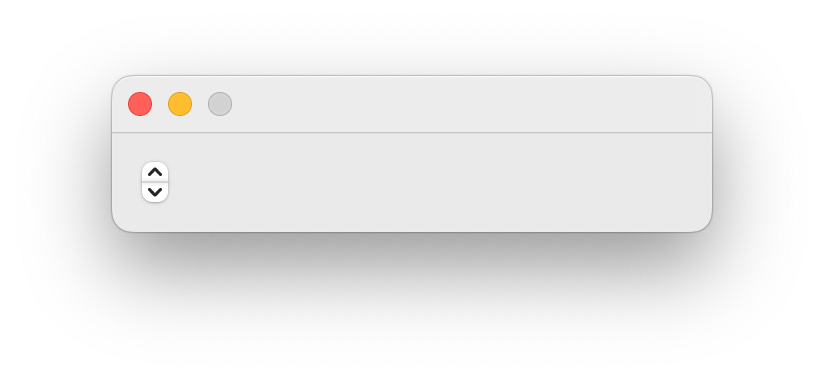
Stepper
- class ezui.Stepper
A stepper button. Steppers are almost always used in combination with a :py:class:TextField. An item group combining A
TextFieldand aStepperis availabe with :py:class:TextFieldAndStepper. Stepper usage reference.A Stepper is created with the string
(±).[__](±) @identifier
import ezui

class DemoController(ezui.WindowController):

    def build(self):
        content = """
        (±) @myStepper
        """
        descriptionData = dict(
            myStepper=dict(
                valueType="integer",
                value=50,
                minValue=0,
                maxValue=100,
                valueIncrement=10
            )
        )
        self.w = ezui.EZWindow(
            content=content,
            descriptionData=descriptionData,
            controller=self,
            size=(300, "auto")
        )

    def started(self):
        self.w.open()

    def myStepperCallback(self, sender):
        print("Stepper:", sender.get())


DemoController()
Description Data
valueTypeThe type of value allowed to be entered."integer""float"
minValueThe minimum value for the stepper.maxValueThe maximum value for the stepper.valueThe starting value for the stepper.valueIncrementThe increment to be added/subtracted when the stepper is pressed.autoRepeatsIf the stepper auto-repeats.callbackThe function to call when the stepper is pressed.toolTipThe text for the view’s tooltip.- get()
Get the value from the stepper.
- enable(onOff)
Enable or disable the object. onOff should be a boolean.
- set(value)
Set a value into the stepper.
- show(onOff)
Show or hide the object.
onOff A boolean value representing if the object should be shown or not.
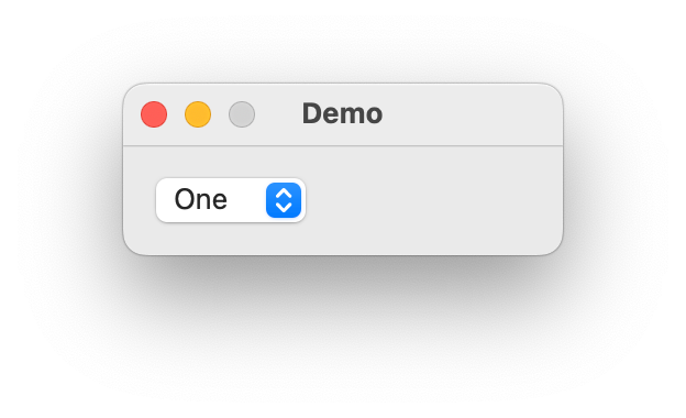
PopUpButton
- class ezui.PopUpButton
A pop up button. PopUpButton usage reference.
A PopUpButton is created with a line starting with
(and ending with...). The enclosed text will be used to select the menu item with the same title in theitemslist if possible.(This is a PopUpButton. ...) @identifier
import ezui

class DemoController(ezui.WindowController):

    def build(self):
        content = """
        (One ...) @popUpButton
        """
        descriptionData = dict(
            popUpButton=dict(
                items=[
                    "One",
                    "Two",
                    "Three"
                ]
            )
        )
        self.w = ezui.EZWindow(
            title="Demo",
            size=(200, "auto"),
            content=content,
            descriptionData=descriptionData,
            controller=self
        )

    def started(self):
        self.w.open()

    def popUpButtonCallback(self, sender):
        print(sender.get())

DemoController()
Description Data
itemsThe list of strings to show in the menu.selectedThe selected item.callbackThe function to call when an item in the menu is selected.toolTipThe text for the view’s tooltip.- enable(onOff)
Enable or disable the object. onOff should be a boolean.
- get()
Get the index selected item in the pop up list.
- getItem()
Get the selected item title in the pop up list.
- getItems()
Get the list of items that appear in the pop up list.
- set(value)
Set the index of the selected item in the pop up list.
- setItem(item)
Set the selected item title in the pop up list.
- setItems(items)
Set the items to appear in the pop up list.
- show(onOff)
Show or hide the object.
onOff A boolean value representing if the object should be shown or not.
SegmentButton
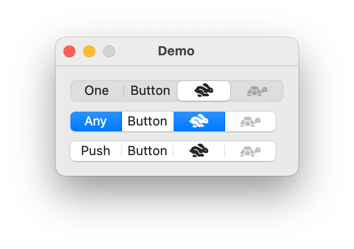
- class ezui.SegmentButton
A button with sub segments. SegmentButton usage reference.
A SegmentButton is created with segments delimited with
|and enclosed in(and). The contents of the segment can be either text or a SF Symbol name enclosed in{and}.One level of
()creates a"one"style button.(Segment One | Segment Two | {paintpalette.fill})Two levels of
()create an"any"style button.((Segment One | Segment Two | {paintpalette.fill}))Three levels of
()create a"push"style button.(((Segment One | Segment Two | {paintpalette.fill})))Selected segments can be indicated by enclosing the text or symbol within
XandX.(Segment One | X Segment Two X | {paintpalette.fill})Disabled segments can be indicated by enclosing the text or symbol within
~and~.(Segment One | ~Segment Two~ | {paintpalette.fill})import ezui class DemoController(ezui.WindowController): def build(self): content = """ ( One | Button | X {hare.fill} X | ~ {tortoise.fill} ~ ) @oneButton (( X Any X | Button | X {hare.fill} X | ~ {tortoise.fill} ~ )) @anyButton ((( Push | Button | {hare.fill} | ~ {tortoise.fill} ~ ))) @pushButton """ self.w = ezui.EZWindow( title="Demo", content=content, controller=self ) def started(self): self.w.open() def oneButtonCallback(self, sender): print("oneButton:", sender.get()) def anyButtonCallback(self, sender): print("anyButton:", sender.get()) def pushButtonCallback(self, sender): print("pushButton:", sender.get()) DemoController()
Description Data
segmentDescriptionsA segment description dictionaries.key
value
default
"width"The desired width of the segment.
"auto"optional
"text"The text of the segment.
""optional
"enabled"The enabled state of the segment.
Trueoptional
"image"A
NSImageobject to display in the segment. UsemakeImageto create the object.Noneoptional
styleThe selection style."one"Only one segment may be selected."any"Zero or more segments may be selected."push"Segments like push buttons.
sizeStyleThe size of the item."mini""small""regular"
selectedThe selected segment or segments. Ifstyleif"one"this will be an integer. Ifstyleis"any"this will be a tuple/list of integers.callbackThe function to call when a segment is selected.toolTipThe text for the view’s tooltip.- enable(onOff, indexes=None)
Enable or disable the object. onOff should be a boolean. If
indexesis given, only that indexes in that list will be changed. IfindexesisNoneall segments will be changed.
- get()
Get the selected segment. If this control is set to
anymode, the returned value will be a list of integers. Otherwise the returned value will be a single integer orNoneif no segment is selected.
- set(value)
Set the selected segment. If this control is set to
anymode,valueshould be a list of integers. Otherwisevalueshould be a single integer.
- show(onOff)
Show or hide the object.
onOff A boolean value representing if the object should be shown or not.
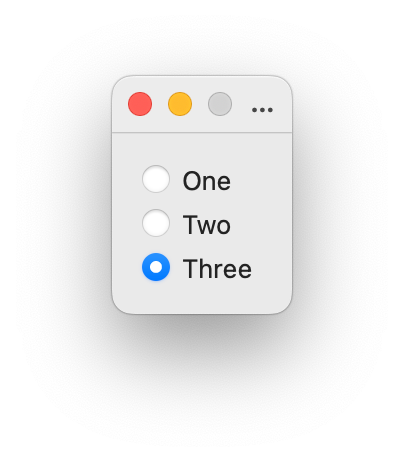
RadioButtons
- class ezui.RadioButtons
A group of radio buttons. RadioButtons usage reference.
Text Description
RadioButtons are created with two lines starting with
( )or(X).( )indicates that the button is unselected.(X)indicates that the button is selected. The identifier for the group of buttons should be defined on the first line.( ) Radio Button 1 @identifier ( ) Radio Button 2 (X) Radio Button 3
import ezui

class DemoController(ezui.WindowController):

    def build(self):
        content = """
        ( ) One     @radioButtons
        ( ) Two
        (X) Three
        """
        self.w = ezui.EZWindow(
            title="Demo",
            content=content,
            controller=self
        )

    def started(self):
        self.w.open()

    def radioButtonsCallback(self, sender):
        print(sender.get())

DemoController()
Description Data
textA list of titles for the buttons.selectedAn integer specifying the selected button.callbackThe function to call when a button is selected.sizeStyleThe size of the item."mini""small""regular"
toolTipThe text for the view’s tooltip.- get()
Get the selected button.
- set(index)
Set the selected button.
- enable(onOff)
Enable or disable the object. onOff should be a boolean.
- show(onOff)
Show or hide the object.
onOff A boolean value representing if the object should be shown or not.
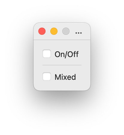
Checkbox
- class ezui.Checkbox
A checkbox, optionally with text next to it. Checkbox usage reference.
A Checkbox is created with a line starting with
[ ],[X]or[-].( )indicates that the checkbox is unselected.[X]indicates that the checkbox is selected.[-]indicates that the checkbox is in a mixed state.[ ] Checkbox
[X] Checkbox
[-] Checkbox
import ezui

class DemoController(ezui.WindowController):

    def build(self):
        content = """
        [ ] On/Off  @onOffCheckbox
        ----------
        [ ] Mixed   @mixedCheckbox
        """
        descriptionData = dict(
            mixedCheckbox=dict(
                allowMixedState=True
            )
        )
        self.w = ezui.EZWindow(
            title="Demo",
            content=content,
            descriptionData=descriptionData,
            controller=self
        )

    def started(self):
        self.w.open()

    def onOffCheckboxCallback(self, sender):
        print("onOffCheckbox:", sender.get())

    def mixedCheckboxCallback(self, sender):
        print("mixedCheckbox:", sender.get())

DemoController()
Description Data
textThe text next to the checkbox.valueThe state of the checkbox.value
state
Falseor0off
Trueor1on
-1mixed (only when
allowMixedStateisTrue)allowMixedStateIf the checkbox allows mixed state.callbackThe function to call when the checkbox is checked/unchecked.sizeStyleThe size of the item."mini""small""regular"
toolTipThe text for the view’s tooltip.- get()
Get the value of the checkbox.
- set(value)
Set the value of the checkbox.
- enable(onOff)
Enable or disable the object. onOff should be a boolean.
- getTitle()
Get the control title.
- setTitle(title)
Set the control title.
title A string representing the title.
- show(onOff)
Show or hide the object.
onOff A boolean value representing if the object should be shown or not.
- toggle()
Toggle the state of the check box.
If the check box is on, turn it off. If the check box is off, turn it on.
Checkboxes
- class ezui.Checkboxes
A group of checkboxes. Checkboxes usage reference.
Text Description
Checkboxes are created with two lines starting with
[ ],[X]or[-].( )indicates that the checkbox is unselected.[X]indicates that the checkbox is selected.[-]indicates that the checkbox is in a mixed state.[ ] Checkbox 1 [X] Checkbox 2 [-] Checkbox 3
import ezui

class DemoController(ezui.WindowController):

    def build(self):
        content = """
        [ ] On/Off  @onOffCheckbox
        [ ] Mixed   @mixedCheckbox
        """
        descriptionData = dict(
            mixedCheckbox=dict(
                allowMixedState=True
            )
        )
        self.w = ezui.EZWindow(
            title="Demo",
            content=content,
            descriptionData=descriptionData,
            controller=self
        )

    def started(self):
        self.w.open()

    def onOffCheckboxCallback(self, sender):
        print("onOffCheckbox:", sender.get())

    def mixedCheckboxCallback(self, sender):
        print("mixedCheckbox:", sender.get())

DemoController()
Description Data
checkboxDescriptionsA list of checkbox descriptions as dictionaries. See :py:class:Checkbox for key/value options.toolTipThe text for the view’s tooltip.- enable(onOff)
Enable or disable the object. onOff should be a boolean.
- show(onOff)
Show or hide the object.
onOff A boolean value representing if the object should be shown or not.
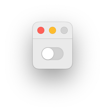
Switch
- class ezui.Switch
A switch. Switch usage reference.
To create a Switch with a text description, use
(-X)or(X-).(-X)indicates that the button should be selected.(X-)indicates that the button should not be selected.(-X) @identifier (X-) @identifier
import ezui

class DemoController(ezui.WindowController):

    def build(self):
        content = """
        (X-) @switch
        """
        descriptionData = dict(
            switch1=dict(
                value=False
            )
        )
        self.w = ezui.EZWindow(
            content=content,
            descriptionData=descriptionData,
            controller=self,
        )

    def started(self):
        self.w.open()

    def switchCallback(self, sender):
        print("switch:", sender.get())

DemoController()
Description Data
callbackThe function to call when the button is pushed.valueThe state of the button.toolTipThe text for the view’s tooltip.- get()
Get the value of the switch.
- set(value)
Set the value of the switch.
- enable(onOff)
Enable or disable the object. onOff should be a boolean.
- show(onOff)
Show or hide the object.
onOff A boolean value representing if the object should be shown or not.
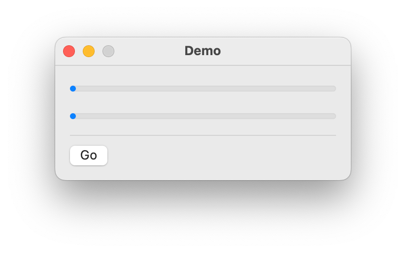
Slider
- class ezui.Slider
A slider. Slider usage reference.
A Slider is defined with a line containing one or more
-and oneX.Optionally the Slider can be circular with a
Ø.-----X----- @identifier
import ezui

class DemoController(ezui.WindowController):

    def build(self):
        content = """
        -----X--------------- @noTickMarks
        ----------X---------- @withTickMarks
        ---------------X----- @stopOnTickMarks
        Ø                     @circularSlider
        """
        descriptionData = dict(
            noTickMarks=dict(
                minValue=0,
                maxValue=1,
                value=0.25
            ),
            withTickMarks=dict(
                minValue=0,
                maxValue=1,
                value=0.5,
                tickMarks=10
            ),
            stopOnTickMarks=dict(
                minValue=0,
                maxValue=1,
                value=0.75,
                tickMarks=10,
                stopOnTickMarks=True
            )
        )
        self.w = ezui.EZWindow(
            title="Demo",
            size=(200, "auto"),
            content=content,
            descriptionData=descriptionData,
            controller=self
        )

    def started(self):
        self.w.open()

    def noTickMarksCallback(self, sender):
        print("noTickMarks:", sender.get())

    def withTickMarksCallback(self, sender):
        print("withTickMarks:", sender.get())

    def stopOnTickMarksCallback(self, sender):
        print("stopOnTickMarks:", sender.get())

DemoController()
Description Data
minValueThe minimum value for the slider.maxValueThe maximum value for the slider.valueThe starting value for the slider.tickMarksThe number of tick marks.Noneor a number.stopOnTickMarksIf the slider only stops on the tick marks.continuousIf the slider calls the callback continuously or only after the user has stopped moving the knob.callbackThe function to call when the slider is slid.sizeStyleThe size of the item."mini""small""regular"
toolTipThe text for the view’s tooltip.- enable(onOff)
Enable or disable the object. onOff should be a boolean.
- get()
Get the value of the slider.
- set(value)
Set the value of the slider.
- show(onOff)
Show or hide the object.
onOff A boolean value representing if the object should be shown or not.
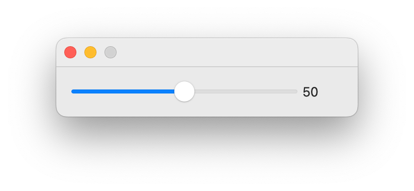
SliderAndLabel
- class ezui.SliderAndLabel
A slider and a label. See Slider and Label for documentation on the components.
A SliderAndLabel is defined with a line containing one or more
-and oneXfollowed by a space followed by text.Optionally the Slider can be circular with a
Ø.-----X----- [__] @identifier
import ezui

class DemoController(ezui.WindowController):

    def build(self):
        content = """
        ---X--- 123 @mySlider
        """
        descriptionData = dict(
            mySlider=dict(
                valueType="integer",
                value=50,
                minValue=0,
                maxValue=100
            )
        )
        self.w = ezui.EZWindow(
            content=content,
            descriptionData=descriptionData,
            controller=self,
            size=(300, "auto")
        )

    def started(self):
        self.w.open()

    def mySliderCallback(self, sender):
        print("Slider:", sender.get())

DemoController()
Description Data
sliderWidthThe width of the Slider.labelWidthThe width of the TextField.callbackThe function to call when the slider is slid.toolTipThe text for the view’s tooltip.- enable(onOff)
Enable or disable the object. onOff should be a boolean.
- show(onOff)
Show or hide the object.
onOff A boolean value representing if the object should be shown or not.
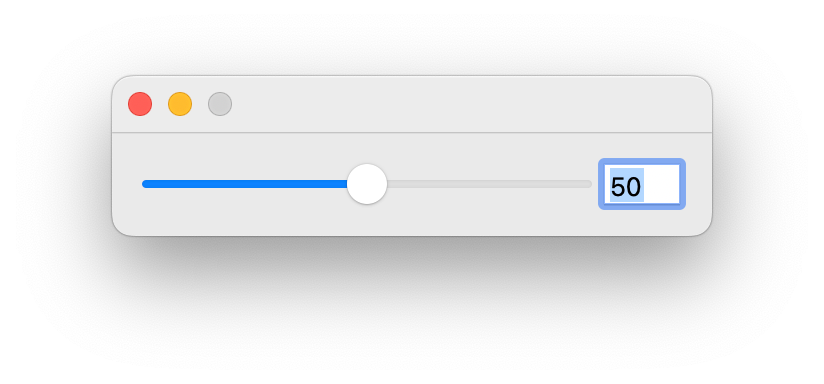
SliderAndTextField
- class ezui.SliderAndTextField
A slider and a text field. See Slider and TextField for documentation on the components.
A SliderAndTextField is defined with a line containing one or more
-and oneXfollowed by a space followed by[_and ending with_].Optionally the Slider can be circular with a
Ø.-----X----- [__] @identifier
import ezui

class DemoController(ezui.WindowController):

    def build(self):
        content = """
        ---X--- [__] @mySlider
        """
        descriptionData = dict(
            mySlider=dict(
                valueType="integer",
                value=50,
                minValue=0,
                maxValue=100
            )
        )
        self.w = ezui.EZWindow(
            content=content,
            descriptionData=descriptionData,
            controller=self,
            size=(300, "auto")
        )

    def started(self):
        self.w.open()

    def mySliderCallback(self, sender):
        print("Slider:", sender.get())

    def mySliderTextFieldCallback(self, sender):
        print("TextField:", sender.get())

DemoController()
Description Data
sliderWidthThe width of the Slider.textFieldWidthThe width of the TextField.callbackThe function to call when the slider is slid or when the text is changed.toolTipThe text for the view’s tooltip.- enable(onOff)
Enable or disable the object. onOff should be a boolean.
- show(onOff)
Show or hide the object.
onOff A boolean value representing if the object should be shown or not.
SliderTextFieldAndStepper
- class ezui.SliderTextFieldAndStepper
A slider, a text field and a stepper. See Slider, TextField and stepper for documentation on the components.
A SliderTextFieldAndStepper is defined with a line containing one or more
-and oneXfollowed by a space followed by[_and ending with_](±).Optionally the Slider can be circular with a
Ø.-----X----- [__](±) @identifier
import ezui

class DemoController(ezui.WindowController):

    def build(self):
        content = """
        ---X--- [__](±) @mySliderTextFieldAndStepper
        """
        descriptionData = dict(
            mySlider=dict(
                valueType="integer",
                value=50,
                minValue=0,
                maxValue=100
            )
        )
        self.w = ezui.EZWindow(
            content=content,
            descriptionData=descriptionData,
            controller=self,
            size=(300, "auto")
        )

    def started(self):
        self.w.open()

    def mySliderTextFieldAndStepperCallback(self, sender):
        print("SliderTextFieldAndStepper:", sender.get())

DemoController()
Description Data
sliderWidthThe width of the Slider.textFieldWidthThe width of the TextField.callbackThe function to call when the slider is slid or when the text is changed.toolTipThe text for the view’s tooltip.- enable(onOff)
Enable or disable the object. onOff should be a boolean.
- show(onOff)
Show or hide the object.
onOff A boolean value representing if the object should be shown or not.
PullDownButton
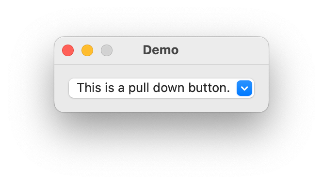
- class ezui.PullDownButton
A pull down button that displays a menu. PullDownButton usage reference.
Text Description
A PullDownButton is created with a line starting with
((and ending with...)). The contents of the button can be either text or a SF Symbol name enclosed in{and}.((This is a PullDownButton. ...)) @identifier
import ezui

class DemoController(ezui.WindowController):

    def build(self):
        content = """
        ((This is a pull down button. ...)) @pullDownButton
        """
        descriptionData = dict(
            pullDownButton=dict(
                itemDescriptions=[
                    dict(
                        identifier="item1",
                        text="Item 1"
                    ),
                    dict(
                        identifier="header1",
                        text="This is a section header.",
                        sectionHeader=True
                    ),
                    dict(
                        identifier="item2",
                        text="Item 2",
                        state=1
                    ),
                    dict(
                        identifier="item3",
                        text="Item 3",
                        hidden=True
                    ),
                    "---",
                    dict(
                        identifier="item4",
                        text="Item 4",
                        state=1,
                        enabled=False
                    )
                ]
            )
        )
        self.w = ezui.EZWindow(
            title="Demo",
            content=content,
            descriptionData=descriptionData,
            controller=self
        )

    def started(self):
        self.w.open()

    def item1Callback(self, sender):
        button = self.w.getItem("pullDownButton")
        state = button.getMenuItemState("item1")
        button.setMenuItemState("item1", not state)

    def item2Callback(self, sender):
        button = self.w.getItem("pullDownButton")
        state = button.getMenuItemState("item2")
        button.setMenuItemState("item2", not state)

DemoController()
Description Data
itemDescriptionsThe list of menu item descriptions. SeebuildMenuItems()for the structure.textThe text for the button.imageThe image for the button.toolTipThe text for the view’s tooltip.If no
textorimageis given the menu will be shown as a pop-up menu.Callbacks
The
senderthat will be sent to the callback will be aNSMenuItem. To get the identifier for this item, use thegetMenuItemIdentifiermethod.- enable(onOff)
Enable or disable the object. onOff should be a boolean.
- getMenuItem(identifier)
Get the
NSMenuItemforidentifier.
- getMenuItemEnabled(identifier)
Get the enabled state for
identifier.
- getMenuItemHidden(identifier)
Get the hidden state for
identifier.
- getMenuItemState(identifier)
Get the state for
identifier.
- getMenuItemText(identifier)
Get the text for
identifier.
- setMenuItemEnabled(identifier, value)
Set the enabled state for
identifier.
- setMenuItemHidden(identifier, value)
Set the hidden state for
identifier.
- setMenuItemState(identifier, value)
Set the state for
identifier.
- setMenuItemText(identifier, value)
Set the text for
identifier.
- show(onOff)
Show or hide the object.
onOff A boolean value representing if the object should be shown or not.
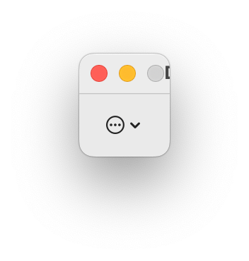
ActionButton
- class ezui.ActionButton
An action button. ActionButton usage reference.
An ActionButton is created with the string
(...).(...) @identifier
import ezui

class DemoController(ezui.WindowController):

    def build(self):
        content = """
        (...) @actionButton
        """
        descriptionData = dict(
            actionButton=dict(
                itemDescriptions=[
                    dict(
                        identifier="basicItem",
                        text="Basic Item"
                    ),
                    "-----",
                    dict(
                        identifier="stateItem",
                        text="State Item",
                        state=1
                    )
                ]
            )
        )
        self.w = ezui.EZWindow(
            title="Demo",
            content=content,
            descriptionData=descriptionData,
            controller=self
        )

    def started(self):
        self.w.open()

    def basicItemCallback(self, sender):
        print("Basic item selected.")

    def stateItemCallback(self, sender):
        print("State item selected.")
        # XXX should the sender be wrapped?
        state = sender.state()
        sender.setState_(not state)

DemoController()
Description Data
itemDescriptionsThe list of menu item descriptions. SeebuildMenuItems()for the structure.toolTipThe text for the view’s tooltip.- enable(onOff)
Enable or disable the object. onOff should be a boolean.
- getMenuItem(identifier)
Get the
NSMenuItemforidentifier.
- getMenuItemEnabled(identifier)
Get the enabled state for
identifier.
- getMenuItemHidden(identifier)
Get the hidden state for
identifier.
- getMenuItemState(identifier)
Get the state for
identifier.
- getMenuItemText(identifier)
Get the text for
identifier.
- setMenuItemEnabled(identifier, value)
Set the enabled state for
identifier.
- setMenuItemHidden(identifier, value)
Set the hidden state for
identifier.
- setMenuItemState(identifier, value)
Set the state for
identifier.
- setMenuItemText(identifier, value)
Set the text for
identifier.
- show(onOff)
Show or hide the object.
onOff A boolean value representing if the object should be shown or not.
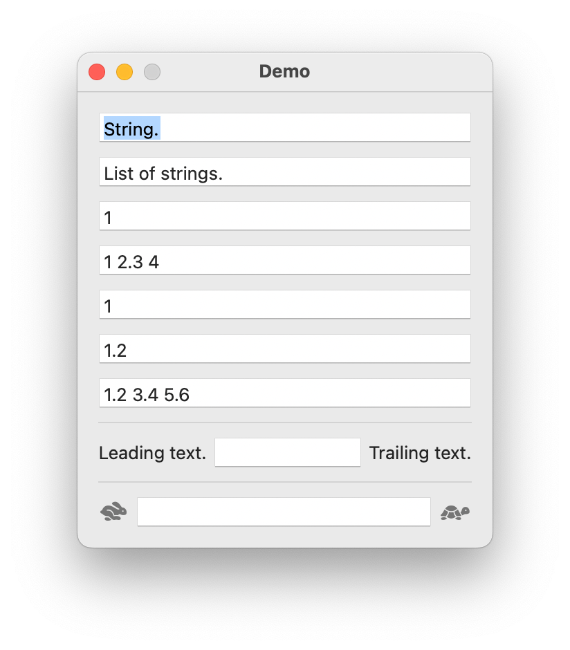
TextField
- class ezui.TextField
A field with editable text. TextField usage reference.
A TextField is created with a line starting with
[_and ending with_]. Any text enclosed, , except all_, will be used as the default value.[_This is a TextField._] @identifier
You can add leading and/ or trailing text by adding text before and/are after the
[].Some leading text. [_This is a TextField._] Some trailing text. @identifier
You can add leading and/ or trailing images by adding enclosing SF Symbol names in
{}before and/are after the[__].{square.fill} [_This is a TextField._] {circle.fill} @identifierimport ezui def colorNumberFormatter(attributes): value = attributes["value"] if value is None: color = (0.5, 1, 0, 1) elif value < 0: color = (1, 0, 0, 1) elif value > 0: color = (0, 1, 0, 1) else: color = (0, 0, 1, 1) attributes["fillColor"] = color class DemoController(ezui.WindowController): def build(self): content = """ [_String. _] @stringTextField [_List of strings._] @stringListTextField [_1 _] @numberTextField [_1 2.3 4 _] @numberListTextField [_1 _] @integerTextField [_1.2 _] @floatTextField [_1.2 3.4 5.6 _] @floatListTextField ----- Formatting. [_ _] @formattedTextField ----- Leading text. [______] Trailing text. ----- {hare.fill} [______] {tortoise.fill} """ descriptionData = dict( stringTextField=dict( placeholder="Enter a string.", valueType="string" ), stringListTextField=dict( placeholder="Enter a list of strings.", valueType="stringList" ), numberTextField=dict( placeholder="Enter a number.", valueType="number" ), numberListTextField=dict( placeholder="Enter a list of numbers.", valueType="numberList" ), integerTextField=dict( placeholder="Enter an integer.", valueType="integer" ), floatTextField=dict( placeholder="Enter a float.", valueType="float" ), floatListTextField = dict( placeholder="Enter a list of floats.", valueType="floatList" ), formattedTextField=dict( placeholder="Enter a number.", valueType="number", stringFormatter=colorNumberFormatter, value=-1, ) ) self.w = ezui.EZWindow( title="Demo", size=(300, "auto"), content=content, descriptionData=descriptionData, controller=self ) def started(self): self.w.open() def stringTextFieldCallback(self, sender): print(f"stringTextField: {sender.get()} {type(sender.get())}") def stringListTextFieldCallback(self, sender): print(f"stringListTextField: {sender.get()} {type(sender.get())}") def numberTextFieldCallback(self, sender): print(f"numberTextField: {sender.get()} {type(sender.get())}") def numberListTextFieldCallback(self, sender): print(f"numberListTextField: {sender.get()} {type(sender.get())}") def integerTextFieldCallback(self, sender): print(f"integerTextField: {sender.get()} {type(sender.get())}") def integerListTextFieldCallback(self, sender): print(f"integerListTextField: {sender.get()} {type(sender.get())}") def floatTextFieldCallback(self, sender): print(f"floatTextField: {sender.get()} {type(sender.get())}") def floatListTextFieldCallback(self, sender): print(f"floatListTextField: {sender.get()} {type(sender.get())}") DemoController()
Description Data
textThe text in the field.placeholderThe placeholder text.valueTypeThe type of value allowed to be entered."string""stringList""number""numberList""integer""integerList""float""floatList"
number, numberList, float and floatList default to rounding to three decimal places for display in the field. If you want more or less precision, add “:#” to the value type where “#” is an integer.
valueFallbackThe value to return when the text can’t be converted tovalueType.valueListDelimiterThe delimiter to use when breaking the value into lists.minValueListItemsThe minimum number of items allowed when breaking the value into lists.maxValueListItemsThe maxium number of items allowed when breaking the value into lists.valueIncrementThe value to add/substract when the up and down arrow keys are pressed.minValueThe minimum allowed value.maxValueThe maximum allowed value.evaluateValueAsEquationIf simple math equations may be entered instead of absolute values.valueToStringConverterA value to string converter. Optional.stringToValueConverterA string to value converter. Optional.stringFormatterA string formatter. Optional.valueWidthThe width of the value entry field.leadingTextThe leading text.leadingImageThe leading image. UsemakeImage()to create the object.leadingTextWidthThe width of the leading text.leadingImageWidthThe width of the leading image.trailingTextThe trailing text.trailingImageThe trailing image. UsemakeImage()to create the object.trailingTextWidthThe trailing text width.trailingImageWidthThe trailing image width.continuousIf the callback is called immidiately after every key press.callbackThe function to call when the text is changed.sizeStyleThe size of the item."mini""small""regular"
toolTipThe text for the view’s tooltip.- get()
Get the text.
- set(value)
Set the text.
- setFont(name=None, systemStyle=None, size=None, weight=None, designStyle=None, sizeStyle='regular')
Set the font in the field.
This uses
makeFont()to create the NSFont. Refer tomakeFontfor documentation on the possible arguments.
- show(onOff)
Show or hide the object.
onOff A boolean value representing if the object should be shown or not.
- enable(onOff)
Enable or disable the object. onOff should be a boolean.
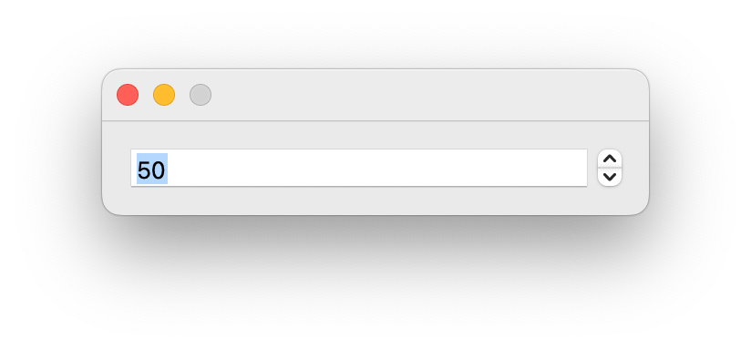
TextFieldAndStepper
- class ezui.TextFieldAndStepper
A text field and a stepper. See TextField and Stepper for documentation on the components.
A TextFieldAndStepper is defined with a line containing
[_and ending with_](±).[__](±) @identifier
import ezui

class DemoController(ezui.WindowController):

    def build(self):
        content = """
        [__](±) @myTextFieldAndStepper
        """
        descriptionData = dict(
            myTextFieldAndStepper=dict(
                valueType="integer",
                value=50,
                minValue=0,
                maxValue=100,
                valueIncrement=10
            )
        )
        self.w = ezui.EZWindow(
            content=content,
            descriptionData=descriptionData,
            controller=self,
            size=(300, "auto")
        )

    def started(self):
        self.w.open()

    def myTextFieldAndStepperCallback(self, sender):
        print("TextFieldAndStepper:", sender.get())

DemoController()
Description Data
textFieldWidthThe width of the TextField.callbackThe function to call when the stepper is pushed or when the text is changed.toolTipThe text for the view’s tooltip.- enable(onOff)
Enable or disable the object. onOff should be a boolean.
- show(onOff)
Show or hide the object.
onOff A boolean value representing if the object should be shown or not.
ComboBox
- class ezui.ComboBox
A combo box. ComboBox usage reference.
A ComboBox is created with a line that starts with
[_and ends with...]. Any enclosed text will be used as the default value.[_This is a ComboBox. ...]
import ezui

class DemoController(ezui.WindowController):

    def build(self):
        content = """
        [_This is a ComboBox. ...] @comboBox
        """
        descriptionData = dict(
            comboBox=dict(
                items=[
                    "AAA",
                    "BBB",
                    "CCC"
                ]
            )
        )
        self.w = ezui.EZWindow(
            title="Demo",
            size=(300, "auto"),
            content=content,
            descriptionData=descriptionData,
            controller=self
        )

    def started(self):
        self.w.open()

    def comboBoxCallback(self, sender):
        print(f"comboBox: {sender.get()}")

DemoController()
Description Data
itemsA list of string options for the combo box.A dict of form
{display value : internal value}may given instead of a list. In this case:the dict’s keys will be the items shown in the combo box.
getwill return the internal value when the displayed value is a key in the dict.setwill accept either the display or internal value. It will display the display value whenever possible.
valueThe default value.continuousIf the callback is called after each key down event or only when the user is finished editing.toolTipThe text for the view’s tooltip.RoboFont Addition
If you want to present a list of glyph names from a font in the combo box, a dict of items is available as a representation.
items = font.asDefcon().unicodeData.getRepresentation(
    "ezuiGlyphSearchValues"
)
This representation factory has the following options:
onlyGlyphNamesA list of glyph names to use. If none are given, all glyph names in the font will be used.useGlyphOrderA boolean indicating if you want to use the font’s glyph order sintead of alphabetical order. The default isFalse.sortBySuffixA boolean indicating if you want the glyphs sorted into suffix groups. The default isTrue.includeGlyphNamesA boolean indicating if you want glyph names included in the display values. The default isTrue.includeUnicodesA boolean indicating if you want unicodes included in the display values. The default isTrue.includeSuffixedUnicodesA boolean indicating if you want suffixed unicodes (ex: 0041.sc) included in the display values. The default isTrue.includeCharactersA boolean indicating if you want characters included in the display values. The default isTrue.includeSuffixedCharactersA boolean indicating if you want suffixed characters (ex: $.sc) included in the display values. The default isTrue.
- get()
Get the text entered in the combo box.
- set(value)
Set the text in the text field of the combo box.
value A string to set in the combo box.
- setItems(items)
Set the items in the combo box list.
items A list of strings to set in the combo box list.
- enable(onOff)
Enable or disable the object. onOff should be a boolean.
- getItems()
Get the items in the combo box as a list.
- show(onOff)
Show or hide the object.
onOff A boolean value representing if the object should be shown or not.
ColorWell
- class ezui.ColorWell
A control that shows a color and, when pressed, displays the system color picker. ColorWell usage reference.
To create a ColorWell with a text description, use the item type name token
* ColorWell.import ezui class DemoController(ezui.WindowController): def build(self): content = """ * ColorWell @colorWell1 * ColorWell @colorWell2 """ descriptionData = dict( colorWell1=dict( color=(1, 0, 0, 1) ), colorWell2=dict( color=(0, 0, 1, 1) ) ) self.w = ezui.EZWindow( title="Demo", size=(200, "auto"), content=content, descriptionData=descriptionData, controller=self ) def started(self): self.w.open() def colorWell1Callback(self, sender): print("colorWell1:", sender.get()) def colorWell2Callback(self, sender): print("colorWell2:", sender.get()) DemoController()
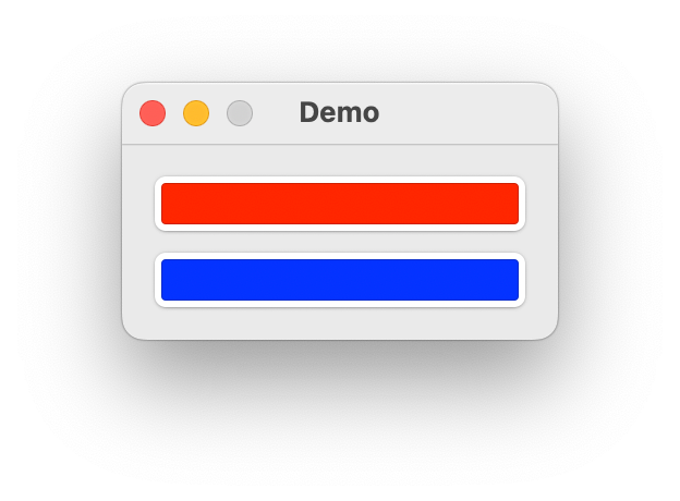
Description Data
colorThe color to set.callbackThe function to call when a color is chosen.toolTipThe text for the view’s tooltip.- get()
Get the color.
- set(color)
Set the color.
- enable(onOff)
Enable or disable the object. onOff should be a boolean.
- show(onOff)
Show or hide the object.
onOff A boolean value representing if the object should be shown or not.
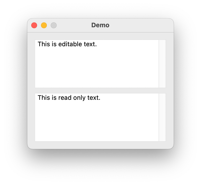
TextEditor
- class ezui.TextEditor
A multi-line text editor. TextEditor usage reference.
A TextEditor is created with a line starting with
[[_and ending with _]]. Any text enclosed will be used as the default value.[[_This is a TextEditor._]]
The editor can be set to be non-editable by adding
~inside the[[_and_]].[[_~ This is a non-editable TextEditor. ~_]]
import ezui

class DemoController(ezui.WindowController):

    def build(self):
        content = """
        [[_This is editable text.     _]] @textEditor1
        [[_~ This is read only text. ~_]] @textEditor2
        """
        self.w = ezui.EZWindow(
            title="Demo",
            size=(300, 200),
            content=content,
            controller=self
        )

    def started(self):
        self.w.open()

    def textEditor1Callback(self, sender):
        print(sender.get())

DemoController()
Description Data
valueThe text in the editor.editableIf the text is editable.callbackThe function to call when the text is changed.sizeStyleThe size of the item."mini""small""regular"
toolTipThe text for the view’s tooltip.- enable(onOff)
Enable or disable the object. onOff should be a boolean.
- get()
Get the contents of the text entry control.
- set(value)
Set the contents of the text box.
value A string representing the contents of the text box.
- show(onOff)
Show or hide the object.
onOff A boolean value representing if the object should be shown or not.
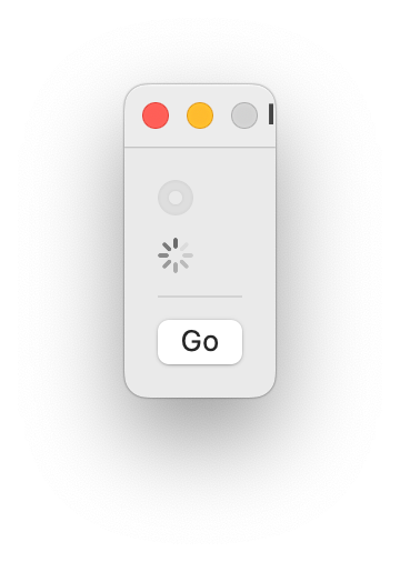
ProgressBar
- class ezui.ProgressBar
A progress bar. ProgressBar usage reference.
A ProgressBar is created with a line containing only
%or%and-.%%%-------
If the line contains only
%the progress bar will show a looping animation.%%%%%%%%%%
import ezui

class DemoController(ezui.WindowController):

    def build(self):
        content = """
        %%%------- @progressBar1
        %%%%%%%%%% @progressBar2
        ----------
        (Go)       @goButton
        """
        descriptionData = dict(
            progressBar1=dict(
                minValue=0,
                maxValue=5
            )
        )
        self.w = ezui.EZWindow(
            title="Demo",
            size=(300, "auto"),
            content=content,
            descriptionData=descriptionData,
            controller=self
        )

    def started(self):
        self.w.open()

    progressBar2Animating = False

    def goButtonCallback(self, sender):
        progressBar1 = self.w.getItem("progressBar1")
        progressBar2 = self.w.getItem("progressBar2")
        if progressBar1.get() == 5:
            progressBar1.set(0)
        else:
            progressBar1.increment()
        if self.progressBar2Animating:
            progressBar2.stop()
            self.progressBar2Animating = False
        else:
            progressBar2.start()
            self.progressBar2Animating = True

DemoController()
Description Data
minValueThe minimum value for the bar. If this isNonethe bar will show a looping animation.maxValueThe maximum value for the bar. If this isNonethe bar will show a looping animation.valueThe initial value of the bar. If this isNone,minValuewill be used.showWhenStoppedIf the bar should be shown when stopped.toolTipThe text for the view’s tooltip.- enable(onOff)
Enable or disable the object. onOff should be a boolean.
- get()
Get the current value of the progress bar.
Only available in determinate progress bars.
- increment(value=1)
Increment the progress bar by value.
Only available in determinate progress bars.
- set(value)
Set the value of the progress bar to value.
Only available in determinate progress bars.
- show(onOff)
Show or hide the object.
onOff A boolean value representing if the object should be shown or not.
- start()
Start the animation.
Only available in indeterminate progress bars.
- stop()
Stop the animation.
Only available in indeterminate progress bars.
ProgressSpinner
- class ezui.ProgressSpinner
A progress spinner. ProgressSpinner usage reference.
A ProgressSpinner is created with a line containing only
%or%%.%
If the line contains
%%the progress spinner will show a looping animation.%%
import ezui

class DemoController(ezui.WindowController):

    def build(self):
        content = """
        %          @progressSpinner1
        %%         @progressSpinner2
        ----------
        (Go)       @goButton
        """
        descriptionData = dict(
            progressSpinner1=dict(
                minValue=0,
                maxValue=5
            )
        )
        self.w = ezui.EZWindow(
            title="Demo",
            content=content,
            descriptionData=descriptionData,
            controller=self
        )

    def started(self):
        self.w.open()

    progressSpinner2Animating = False

    def goButtonCallback(self, sender):
        progressSpinner1 = self.w.getItem("progressSpinner1")
        progressSpinner2 = self.w.getItem("progressSpinner2")
        if progressSpinner1.get() == 5:
            progressSpinner1.set(0)
        else:
            progressSpinner1.increment()
        if self.progressSpinner2Animating:
            progressSpinner2.stop()
            self.progressSpinner2Animating = False
        else:
            progressSpinner2.start()
            self.progressSpinner2Animating = True

DemoController()
Description Data
minValueThe minimum value for the spinner. If this isNonethe spinner will show a looping animation.maxValueThe maximum value for the spinner. If this isNonethe spinner will show a looping animation.valueThe initial value of the spinner. If this isNone,minValuewill be used.showWhenStoppedIf the spinner should be shown when stopped.sizeStyleThe size of the item."mini""small""regular"
toolTipThe text for the view’s tooltip.- enable(onOff)
Enable or disable the object. onOff should be a boolean.
- get()
Get the current value of the progress bar.
Only available in determinate progress bars.
- increment(value=1)
Increment the progress bar by value.
Only available in determinate progress bars.
- set(value)
Set the value of the progress bar to value.
Only available in determinate progress bars.
- show(onOff)
Show or hide the object.
onOff A boolean value representing if the object should be shown or not.
- start()
Start the animation.
Only available in indeterminate progress bars.
- stop()
Stop the animation.
Only available in indeterminate progress bars.
Table
- class ezui.Table
A table of data. This is a simplified version of vanilla.List2.
A table is created with a line that starts with
|and ends with|followed by an identifier.| | @identifier
All text between the
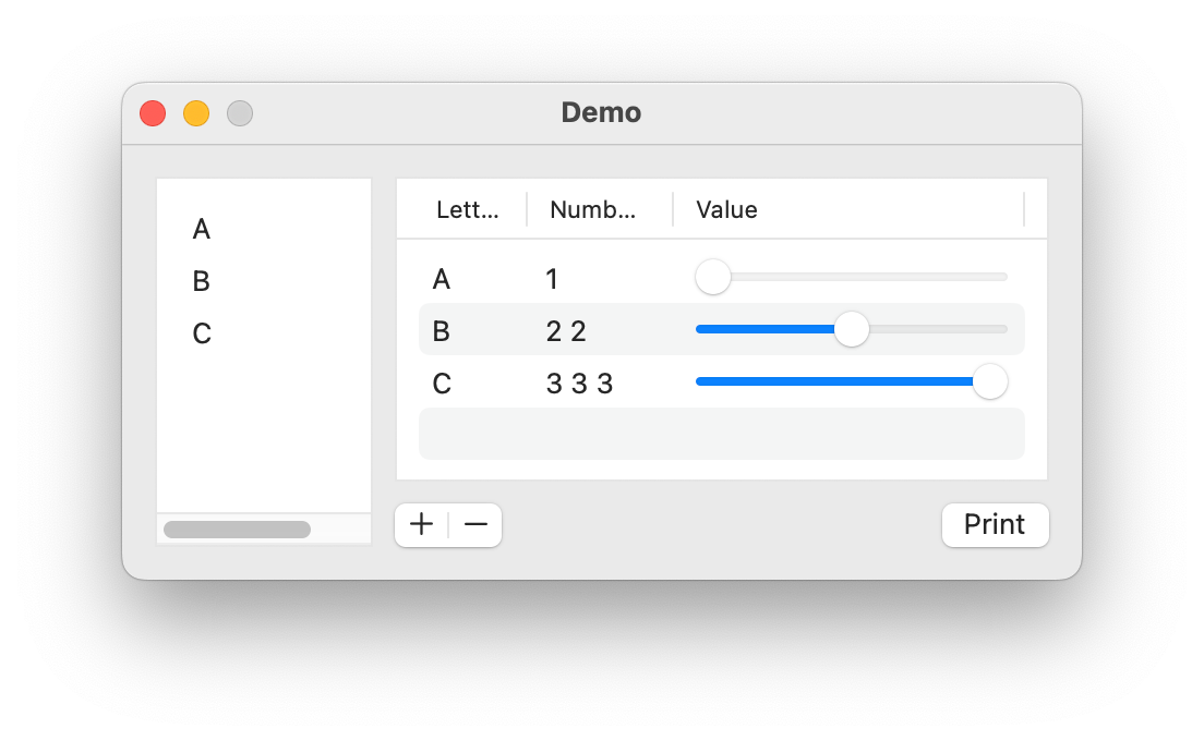
|and|will be ignored. Lines that begin with|and end with|but do not have an identifier will be ignored. This allows for ASCII-art like representations of tables.|-----------------------------| | letter | numbers | value | @complexTable |--------|---------|----------| | A | 1 | --X----- | | | | | |-----------------------------|
A table may have a footer. This can be defined within the text description or with the
footerargument defined below. To define the footer within the text description, follow the table description with items preceded by>and the items will be added to the footer.import ezui class DemoController(ezui.WindowController): def build(self): content = """ = HorizontalStack |-----------------------------| @simpleTable | | |-----------------------------| |-----------------------------| | letter | numbers | value | @complexTable |--------|---------|----------| | A | 1 | --X----- | | | | | |-----------------------------| > (+-) @complexTableAddRemoveButton > (Print) @complexTablePrintButton """ simpleTableItems = [ "A", "B", "C" ] complexTableItems = [ dict( letter="A", numbers=[1], value=0 ), dict( letter="B", numbers=[2, 2], value=0.5 ), dict( letter="C", numbers=[3, 3, 3], value=1 ), ] descriptionData = dict( simpleTable=dict( width=100, items=simpleTableItems ), complexTable=dict( width=300, items=complexTableItems, columnDescriptions=[ dict( identifier="letter", title="Letter", width=35, editable=True ), dict( identifier="numbers", title="Numbers", width=50, cellDescription=dict( valueType="integerList" ), editable=True ), dict( identifier="value", title="Value", cellDescription=dict( cellType="Slider", valueType="float", cellClassArguments=dict( minValue=0, maxValue=1 ), ), editable=True ) ] ) ) self.w = ezui.EZWindow( title="Demo", size=("auto", 200), content=content, descriptionData=descriptionData, controller=self ) def started(self): self.w.open() def simpleTableSelectionCallback(self, sender): print("simpleTable selection:", sender.getSelectedItems()) def complexTableAddRemoveButtonAddCallback(self, sender): table = self.w.getItem("complexTable") item = table.makeItem( letter="X", numbers=[0] ) table.appendItems([item]) def complexTableAddRemoveButtonRemoveCallback(self, sender): table = self.w.getItem("complexTable") table.removeSelectedItems() def complexTablePrintButtonCallback(self, sender): import pprint table = self.w.getItem("complexTable") print("complexTable items:") pprint.pprint(table.get()) DemoController()
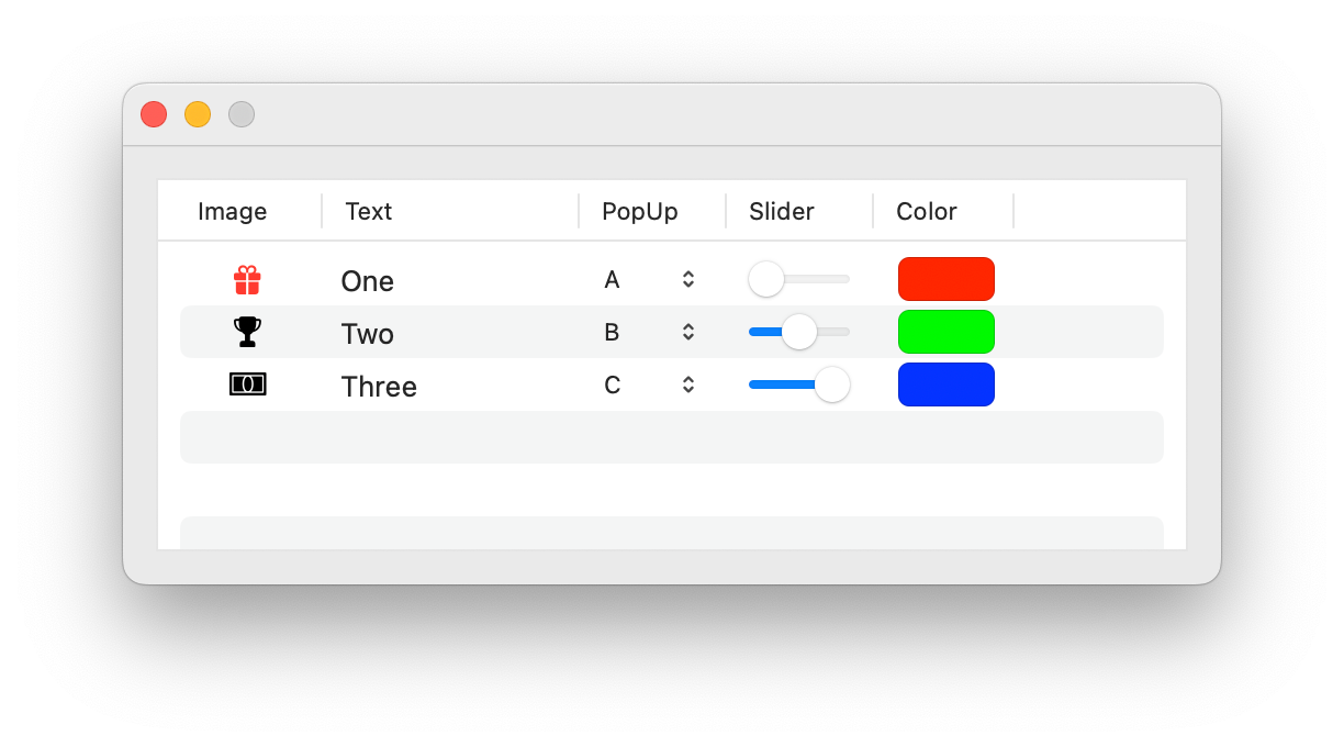
import ezui

items = [
    dict(
        imageValue=ezui.makeImage(symbolName="gift.fill"),
        textValue="One",
        popUpValue=0,
        sliderValue=0,
        colorValue=(1, 0, 0, 1)
    ),
    dict(
        imageValue=ezui.makeImage(symbolName="trophy.fill"),
        textValue="Two",
        popUpValue=1,
        sliderValue=0.5,
        colorValue=(0, 1, 0, 1)
    ),
    dict(
        imageValue=ezui.makeImage(symbolName="banknote.fill"),
        textValue="Three",
        popUpValue=2,
        sliderValue=1,
        colorValue=(0, 0, 1, 1)
    ),
]

class DemoController(ezui.WindowController):

    def build(self):
        content = """
        | ----------------- | @table
        | im | tf | pu | sl |
        | ----------------- |
        """
        descriptionData = dict(
            table=dict(
                items=items,
                columnDescriptions=[
                    dict(
                        identifier="imageValue",
                        title="Image",
                        width=50,
                        editable=False,
                        cellDescription=dict(
                            cellType="Image"
                        )
                    ),
                    dict(
                        identifier="textValue",
                        title="Text",
                        width=100,
                        editable=True
                    ),
                    dict(
                        identifier="popUpValue",
                        title="PopUp",
                        width=50,
                        editable=True,
                        cellDescription=dict(
                            cellType="PopUpButton",
                            cellClassArguments=dict(
                                items=["A", "B", "C"]
                            )
                        )
                    ),
                    dict(
                        identifier="sliderValue",
                        title="Slider",
                        width=50,
                        editable=True,
                        cellDescription=dict(
                            cellType="Slider",
                            cellClassArguments=dict(
                                minValue=0,
                                maxValue=1
                            )
                        )
                    ),
                    dict(
                        identifier="colorValue",
                        title="Color",
                        width=50,
                        editable=True,
                        cellDescription=dict(
                            cellType="ColorWell"
                        )
                    ),
                ]
            )
        )
        self.w = ezui.EZWindow(
            content=content,
            descriptionData=descriptionData,
            controller=self,
            size=(500, 200)
        )

    def started(self):
        self.w.open()

DemoController()
Description Data
itemsThe items to display in the table. Refer to the vanilla.List2 documentation for details about the types of items that are allowed.itemPrototypeA prototype item to be used with themakeItemmethod. IfNoneis given, a prototype item will be derived from thecolumnDescriptions.columnDescriptionsA list of column definition dictionaries. The key/value pairs are the same as the pairs defined in the vanilla.List2 documentation with some additions. These are the most frequently needed pairs:key
value
default
"identifier"The unique identifier for this column.
required
"title"The title to appear in the column header.
None
optional
"cellDescription"A cell description dictionary.
A TextField cell.
optional
"editable"Enable or disable editing in the column.
False
optional
"width"The width of the column.
None
optional
"minWidth"The minimum width of the column.
widthoptional
"maxWidth"The maximum width of the column.
widthoptional
Cell Description Dictionary:
key
value
default
"cellType"The cell type to use.
"TextField"optional
"valueType"The type of value allowed to be entered.
"string"optional.
cellTypemust be"TextField"for this to be used."valueToCellConverter"A function for converting object values to cell values.
functionoptional.
"cellToValueConverter"A function for converting cell values to object values.
functionoptional.
"stringFormatter"A string formatter function.
functionoptional.
"valueFallback"The value to store when the text can’t be converted to
valueType.Noneoptional. Only used if the
valueTypeis defined."valueListDelimiter"The delimiter to use when breaking the value into lists.
" "optional. Only used if the
valueTypeis one of the"List"options."cellClass"The cell class to use.
None
optional
"cellClassArguments"Arguments to use when creating the cell.
{}optional
Cell Types:
"TextField""Slider""Checkbox""PopUpButton""Image""SegmentButton""ColorWell""LevelIndicator"
Cell Value Types:
"string""stringList""number""numberList""integer""integerList""float""floatList"
number, numberList, float and floatList default to rounding to three decimal places for display in the field. If you want more or less precision, add “:#” to the value type where “#” is an integer.
footerA list of item descriptions defining items to place below the table.footershould be formatted as thecontentargument when creating a HorizontalStack. An additional“gravity”` key may be used in the item descriptions to define where the item should align in the footer."leading""center""trailing"
insetFooterIf the footer should be inset.allowsGroupRowsIf group rows are allowed. IfTrueallowsSortingwill automatically be set toFalse.drawFocusRingIf the focus ring should be drawn on the table.showColumnTitlesIf the column titles should be shown.alternatingRowColorsIf the rows have alternating colors.allowsSortingIf the table allows sorting by clicking column titles. This must beFalseif group rows will be used.allowsSelectionIf the table allows item selection.allowsMultipleSelectionIf the table allows multiple selection.allowsEmptySelectionIf the table allows empty selection.selectionCallbackThe callback to call when an item is selected. Use the table’s identifier +"SelectionCallback"as the expected callback name.doubleClickCallbackThe callback to call when an item is double clicked. Use the table’s identifier +"DoubleClickCallback"as the expected callback name.editCallbackThe callback to call when an item is edited. Use the table’s identifier +"EditCallback"as the expected callback name.dragSettingsSee the vanilla.List2 documentation for thedragSettingsdetails.dropSettingsSee the vanilla.List2 documentation for thedropSettingsdetails.toolTipThe text for the view’s tooltip.- makeItem(**kwargs)
Make an item containing the necessary key/value pairs for the table by copying the
itemPrototypegiven or derived during construction. Ifkwargsare given, they will be set into the returned item.
- openPopoverAtIndex(popover, index)
Open the given
EZPopoverobject near the row forindex.
- getItem(index)
Get the item at
index.
- setItem(index, item)
Set the
itematindex.
- insertItemsAtIndex(index, items)
Insert
itemsatindex.
- appendItems(items)
Append
itemsto the end of the table’s contents.
- removeItemsAtIndexes(indexes)
Remove the items at
indexes.
- removeSelectedItems()
Remove the selected items.
- setItemValue(index, identifier, value)
Set the
valuefor the column withidentifierin the item atindex
- getItemValue(index, identifier)
Get the value for the column with
identifierin the item atindex
- get()
Get the list of items in the list.
- set(items)
Set the items in the list.
items should follow the same format as described in the constructor.
- reloadData(indexes=None)
Reload the data on display. This is needed when the items have changed values and the presentation of the items in the list needs to be updated.
indexes may be provided to indicate that only specific items need to be reloaded.
- getSelectedItems()
Get a list of selected items in the list.
- setSelectedItems(items)
Set the selected items in the list.
Note
setSelectedIndexesis the recommended method for setting selection.setSelectedItemsis a convenience method that relies on iteration and comparing object ids to find the item indexes, which are then sent tosetSelectedIndexes. If the list contains a large number of items this iteration can create a performance problem.
- getSelectedIndexes()
Get a list of indexes of selected items in the list.
- setSelectedIndexes(indexes)
Set the selected indexes in the list.
indexes should be a list of indexes.
- scrollToSelection()
Scroll the selected rows to visible.
- scrollToIndex(index)
Scroll the row to visible.
- enable(onOff)
Enable or disable the object. onOff should be a boolean.
- show(onOff)
Show or hide the object.
onOff A boolean value representing if the object should be shown or not.
- class ezui.FileTable
A table of files. This is a simplified version of :py:class:`Table`.
A file table is created with a line that starts with
|, ends with|and containsfilesfollowed by an identifier.| files | @identifier
import ezui

class DemoController(ezui.WindowController):

    def build(self):
        content = """
        |-files----| @fileTable
        |          |
        |----------|
        """
        descriptionData = dict(
            fileTable=dict(
                itemType="dict",
                acceptedDropFileTypes=[".txt", ".md", ".fea"],
                allowsDropBetweenRows=True,
                allowsInternalDropReordering=True,
                columnDescriptions=[
                    dict(
                        identifier="path",
                        title="Path",
                        cellClassArguments=dict(
                            showFullPath=True
                        )
                    ),
                    dict(
                        identifier="lines",
                        title="Line Count"
                    )
                ]
            )
        )
        self.w = ezui.EZWindow(
            title="Demo",
            content=content,
            descriptionData=descriptionData,
            controller=self,
            size=(300, 300)
        )

    def started(self):
        self.w.open()

    def fileTableCreateItemsForDroppedPathsCallback(self, sender, paths):
        items = []
        for path in paths:
            with open(path, "r") as f:
                lines = len(f.read().splitlines())
                item = dict(
                    path=path,
                    lines=lines
                )
                items.append(item)
        return items

DemoController()
Description Data
All of the description data of
Tableis allowed, except fordragSettingsanddropSettings.acceptedDropFileTypesThe file types this table should accept from a drop. These must begin with a.For example, `[“.designspace”, “.ttx”]acceptedDropPasteboardTypesThe accepted pasteboard types this table should accept from a drop. These can beNSPasteboardTypeobjects, vanilla values ("fileURL","string","plist"). Custom pasteboard types are also allowed. If any values are given foracceptedDropFileTypes"fileURL"will be automatically added toacceptedDropPasteboardTypes.itemTypeThe abstract type of item that the table will contain. The options are"object"and “dict“. This value instructs the table on how to get values from the item."object"will use attributes and"dict"will use the dict-like key/value model. If theitemTypeis"object", each item must have apathattribute. If theitemTypeis"dict"each item must have apathkey/value pair.columnDescriptionsThe standard Table column desicriptions. There is a special column description that can be used to show the item’s path:dict( identifier="path", cellDescripion=dict( cellClassArguments=dict( showFullPath=False, truncationMode="middle" ) ) )
showFullPathA boolean indicating if the full path should be shown or just the file name.truncationModeA string indicating the preferred text truncation mode. The options are"clipping","head","tail","middle".
allowsDropBetweenRowsA boolean indicating if dropping items between rows should honor the insertion point of the drop.allowsInternalDropReorderingA boolean indicating if the items in the table can be reordered with drag and drop.allowsDragOutA boolean indicating if items in this table can be dragged and dropped somewhere else.createItemsForDroppedPathsCallbackThe callback to be used when file pathss are dropped onto the table. This method must return items of the type defined initemType. Use the table’s identifier +"CreateItemsForDroppedPathsCallback"as the callback name.def myTableCreateItemsForDroppedPathsCallback(self, sender, paths): documents = [ OpenMyDocument(path) for path in paths ] return documents
makeDragDataCallbackThe callback to be used to pack the items dragged out of the table. This must return a dictionary of form:{ pasteboard type : value}where value must be a structure that can be stored in a plist. Use the table’s identifier +"MakeDragDataCallback"as the callback name. This callback is optional and is only needed when creating custom data types.def myTableMakeDragDataCallback(self, sender, index): item = sender.get()[index] value = { "com.example.type.identifier" : item.asDict() }
filterItemsForImportCallbackThe callback to be used when unpacking dropped items to be added to the table. This must return a list of items ready to be added to the table. Use the table’s identifier +"FilterItemsForImportCallback"as the callback name. This callback is optional and is only needed in complex situations.def myTableMakeDragDataCallback(self, sender, availableDataTypes): items = availableDataTypes["com.example.type.identifier"] return items
- class ezui.FontTable
A table of fontParts fonts. This is a simplified version of :py:class:`FileTable`.
A font table is created with a line that starts with
|, ends with|and containsfontsfollowed by an identifier.| fonts | @identifier
import ezui

class DemoController(ezui.WindowController):

    def build(self):
        content = """
        |-fonts----| @fontsTable1
        |          |
        |----------|

        |-fonts----| @fontsTable2
        |          |
        |----------|
        """
        descriptionData = dict(
            fontsTable1=dict(
                items=AllFonts(),
                acceptedDropFileTypes=[".ufo"],
                allowsDropBetweenRows=True,
                allowsInternalDropReordering=True,
                allowsDragOut=True,
                height=200,
                columnDescriptions=[
                    dict(
                        identifier="path",
                        title="Path",
                        cellDescription=dict(
                            cellClassArguments=dict(
                                showFullPath=True
                            )
                        )
                    ),
                    dict(
                        identifier="name",
                        title="Name"
                    )
                ]
            ),
            fontsTable2=dict(
                acceptedDropFileTypes=[".ufo"],
                allowsDropBetweenRows=True,
                allowsInternalDropReordering=True,
                height=200,
                columnDescriptions=[
                    dict(
                        identifier="familyName",
                        title="Family Name"
                    ),
                    dict(
                        identifier="styleName",
                        title="Style Name"
                    )
                ]
            )
        )
        self.w = ezui.EZWindow(
            content=content,
            descriptionData=descriptionData,
            controller=self,
            size=(500, "auto")
        )

    def started(self):
        self.w.open()

    def fontsTable1CreateItemsForDroppedPathsCallback(self, sender, paths):
        fonts = [
            OpenFont(path, showInterface=False)
            for path in paths
        ]
        return fonts

    def fontsTable2CreateItemsForDroppedPathsCallback(self, sender, paths):
        fonts = [
            OpenFont(path, showInterface=False)
            for path in paths
        ]
        return fonts

DemoController()
Description Data
All of the description data of
FileTableis allowed, except foracceptedDropPasteboardTypes.acceptedDropFileTypesThis lists contains the file types you wish to accept as paths. If you don’t want to accept unopened fonts, leave this list empty.columnDescriptionsThe standard Table column desicriptions. There are a special column descriptions that can be used to show general font info:"path""name""familyName""styleName"
dict(
    identifier="name",
)
If
allowsDragOutisTrueitems dragged out of the table will be described on the “dev.robotools.fontParts.Font.Identifier” pasteboard. If you want to implement read/write on this pasteboard, the following protocols apply:fontParts Dragging Protocol
The data placed on the pasteboard will be the
idof the wrapped defcon object. The dragging source will need to return the fontParts objects that wrap the objects with the given ids in thegetDropItemValuesmethod. For example:def getDropItemValues(self, items, pasteboardType=None): if pasteboardType == "dev.robotools.fontParts.Font.Identifier": idToFontParts = {id(obj.asDefcon()) : obj for obj in self.get()} fontPartsObjects = [] for item in items: wantedID = item.propertyListForType_(pasteboardType) fontPartsObjects.append(idToFontParts[wantedID]) return fontPartsObjects else: ...
If you have questions, contact the ezui developers.
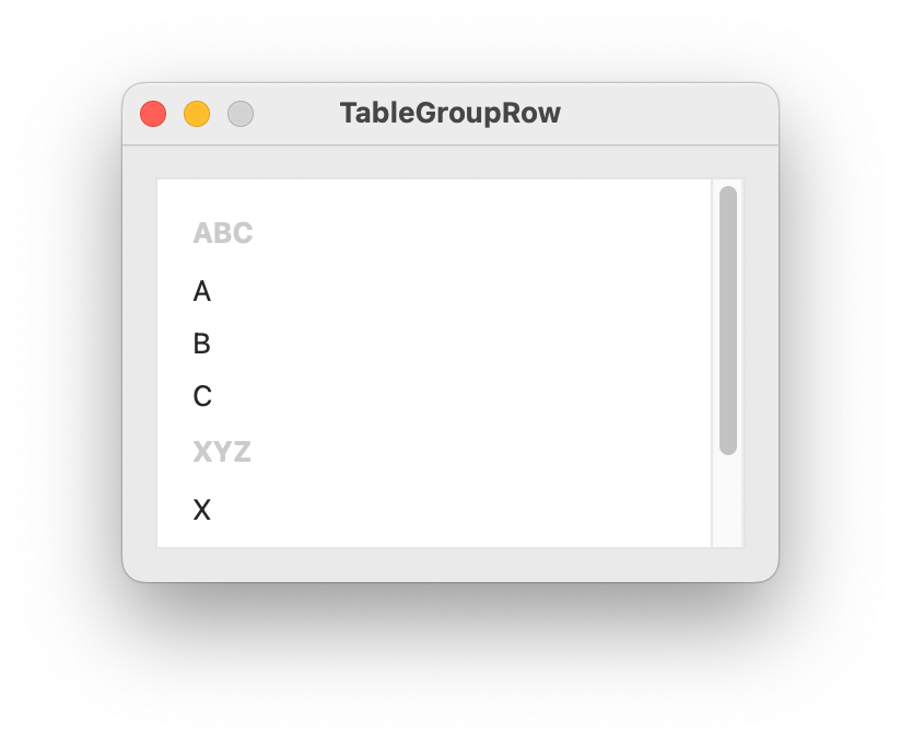
- class ezui.TableGroupRow
A group row item.
textThe title of the group row. Optional.import ezui class DemoController(ezui.WindowController): def build(self): items = [ dict( cellType="TableGroupRow", text="ABC" ), "A", "B", "C", dict( cellType="TableGroupRow", text="XYZ" ), "X", "Y", "Z" ] windowContents = dict( type="Table", items=items, allowsGroupRows=True ) windowDescription = dict( type="Window", size=(300, 200), title="TableGroupRow", content=windowContents ) self.w = ezui.makeItem( windowDescription, controller=self ) def started(self): self.w.open() DemoController()
MerzView
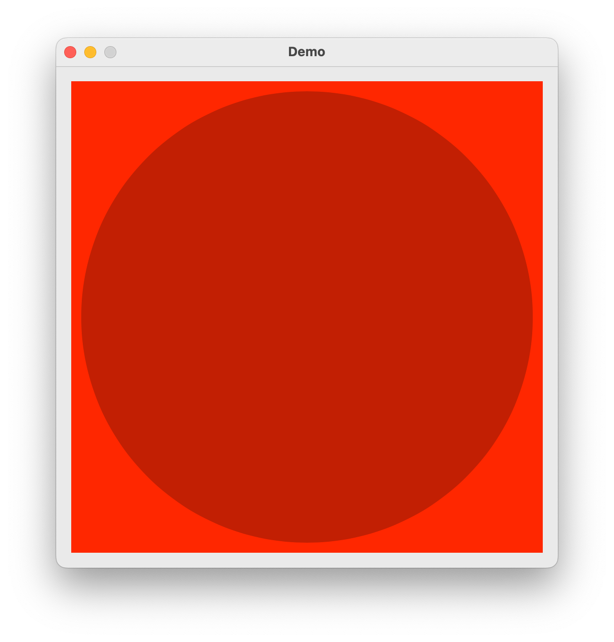
- class ezui.MerzView
A MerzView. See the Merz documentation for details. MerzView Documentation.
To create a MerzView with a text description, use the item type name token
* MerzView.import merz import ezui class DemoController(ezui.WindowController): def build(self): content = """ * MerzView @merzView """ descriptionData = dict( merzView=dict( backgroundColor=(1, 0, 0, 1), delegate=self ) ) self.w = ezui.EZWindow( title="Demo", content=content, descriptionData=descriptionData, size=(500, 500), controller=self ) merzView = self.w.getItem("merzView") merzContainer = merzView.getMerzContainer() merzContainer.appendOvalSublayer( position=("center", "center"), size=(450, 450), fillColor=(0, 0, 0, 0.25) ) self.brushLayer = merzContainer.appendBaseSublayer() def started(self): self.w.open() # Delegate Methods brushSize = 50 brushColor = (1, 1, 0, 0.25) def acceptsFirstResponder(self, sender): return True def mouseDown(self, sender, event): event = merz.unpackEvent(event) position = event["location"] self.brushLayer.appendOvalSublayer( position=position, size=(self.brushSize, self.brushSize), anchor=(0.5, 0.5), fillColor=self.brushColor ) def mouseDragged(self, sender, event): event = merz.unpackEvent(event) position = event["location"] self.brushLayer.appendOvalSublayer( position=position, size=(self.brushSize, self.brushSize), anchor=(0.5, 0.5), fillColor=self.brushColor ) def mouseUp(self, sender, event): self.brushLayer.clearSublayers() DemoController()
- getMerzContainer()
Return the merz container.
ScrollingMerzView
- class ezui.ScrollingMerzView
A ScrollingMerzView. See the Merz documentation for details. ScrollingMerzView Documentation.
To create a ScrollingMerzView with a text description, use the item type name token
* ScrollingMerzView.- getMerzContainer()
Return the merz container.
- getMerzView()
Return the merz document view.
- getMerzViewSize()
Get the size of the merz document view.
- setMerzViewSize(size)
Set the size of the merz document view.
MerzCollectionView
- class ezui.MerzCollectionView
A MerzCollectionView. See the Merz documentation for details. MerzCollectionView Documentation.
To create a MerzCollectionView with a text description, use the item type name token
* MerzCollectionView.
WebView
- class ezui.WebView
A web view. WebView usage reference.
To create a WebView with a text description, use the item type name token
* WebView.import ezui testHTML = """ <html> <head> <style> body { background-color: red; color: white; font-family: "SF Pro"; text-align: center; } h1 { font-weight: 800; font-size: 100px; line-height: 1em; margin: 0; padding: 0; } h2 { font-weight: 100; font-size: 25px; line-height: 1em; margin: 0; padding: 0; } p { font-size: 15px; font-weight: 200; } </style> <script> function click1() { window.webkit.messageHandlers.text1.postMessage("You clicked One."); } function click2() { window.webkit.messageHandlers.text2.postMessage("You clicked Two."); } </script> <head> <body> <h1 onclick="click1()"> One </h1> <h1 onclick="click2()"> Two </h1> <p> Click the text above to trigger callbacks. </p> <h2 id="timeStamp"> </h2> </body> <html> """ class DemoController(ezui.WindowController): def build(self): content = """ * WebView @webView ==================== (Execute JavaScript) @executeJavaScriptButton """ descriptionData = dict( webView=dict( html=testHTML, handlers=[ "text1", "text2" ] ) ) self.w = ezui.EZWindow( content=content, descriptionData=descriptionData, size=(500, 500), controller=self ) def started(self): self.w.open() def text1Callback(self, sender, message): print(message) def text2Callback(self, sender, message): print(message) def executeJavaScriptButtonCallback(self, sender): import time js = f""" var e = document.getElementById("timeStamp"); e.innerText = "{time.strftime('%a, %d %b %Y %H:%M:%S')}"; """ webView = self.w.getItem("webView") webView.executeJavaScript(js) DemoController()
Description Data
htmlHTML to be displayed.handlersA list of handler identifiers. SeeaddHandlerIdentifier()for details.toolTipThe text for the view’s tooltip.- setHTML(html)
Set HTML in the view.
- setURL(url)
Set the url in the HTMLView.
- executeJavaScript(text)
Execute JavaScript within the html in the view.
- addHandlerIdentifier(identifier)
Add a handler identifier that will used to send messages to a callback from JavaScript within the HTML.
The
identifiermust be a string indicating the name of the handler to be used when sending messages back to your controller. Your controller must have a corresponding method with the nameidentifier + "Callback". Your JavaScript code should reference your identifier at the location noted bymyHandlerIdentifierin this code:window.webkit.messageHandlers.myHandlerIdentifier.postMessage("A message,");
The message sent through
postMessagecan be any string.